


European Paintings Reopens at the Met

My father sent me this review of Look Again: European Paintings 1300–1800, which is the name the Metropolitan Museum of Art has given to its pre-1800 European Paintings galleries now that they’ve reopened after being closed for five years. Reading it I thought maybe I should write one of my own. So: on the evening of Saturday, January 27, I spent a few hours in the galleries, came home, and started this newsletter.
First I’ll make a few comments about the Met’s collection. Then I’ll say what I think they needed to do, and whether they did it. Finally I’ll share some more personal impressions.
The Met’s collection
I cherish the Met, but it isn’t the Louvre. The Met’s European paintings collection—here I’m talking about the pre-1800 paintings, the post-1800 ones are in a different set of galleries that I’ll write about another time—is broad, deep, and rich, but for the most part it isn’t exactly first-rate, not if first-rate means Paris or London or Vienna. To explain I’ll use as an example, chosen more or less at random, the fifteenth-century painter Andrea Mantegna. If you know ten Italian artists, you might not know who that is. If you know twenty, you probably do. His Saint Sebastian in the Louvre is a knockout: an eight-foot painting of a muscular, arrow-pierced saint, tied to a column that’s part of a fragment of a ruined arch. Someone once said of Mantegna that his obsession with ancient sculpture was so all-consuming that his figures are more marble than flesh. This was probably meant as a dig, but I think of it and smile. We should all be so lucky in our obsessions.
The Met has Mantegnas, too. They’re charming. There’s the early Adoration of the Shepherds. Each time I look at it I find a new detail to like. The squash hanging over the fence behind Joseph, the cow behind the squash, the angels visiting shepherds on the outcropping at upper right. And there’s the Holy Family with Saint Mary Magdalen, its figures anything but lapidary and surrounded by oranges that seem to glow. You can learn about Mantegna from these two, maybe even fall for him, but if you do then you’re going to want to go to the Louvre. The reverse isn’t true. If you fall for Mantegna in Paris it won’t occur to you to go see the ones in New York.
This is the general pattern.
What a museum like the Met needs to do with its collection
“A museum like the Met” -- by this I mean to say, a museum that (i) has encyclopedic pretensions, wants to show a bit of everything, and (ii) is visited by a mix of locals and tourists. Here are the goals as I see them:
instruction
inspiration
delight
consolation
provocation
Each of the first four goals is for a different group of visitors.
Instruction. You want to make it easy for the curious, people who come to galleries and find themselves asking questions about the history of art. What is all this stuff? Who made it? Why? How? Who paid for it it? The most important things here are chronology and region. It’s hard to learn if curators mix eras and places too much.
Inspiration. Picasso, when he saw African masks in 1907, didn’t need to learn about Congo ritual practices. That kind of knowledge, if he had had it, would probably have gotten in his way. And any insights Manet picked up about the artistic climate of the court of Philip IV of Spain were beside the point for his relationship with Velázquez. Painting isn’t scholarship. The historical and cultural context should be there for those who want it, presented in a way that’s easy to ignore for those who don’t.
Delight. You want to delight the tourists, the people who will walk through these galleries just once, or maybe a few times in their lives. If you go to a museum while you’re on vacation it should be a pleasure. Exhausting maybe, but in a good way. The highlights shouldn’t be hard to find, nor should there be be too many of them. And tourists have this in common with artists looking for inspiration: they don’t want to be bombarded with facts, so there shouldn’t be too much to read. It’s agreeable to learn one or two things, maybe even three, but not more than that.
Consolation. This is for the visitors who are there for the twentieth time, or hundredth. They are neither artists on the hunt for ideas nor provincial youth seeking formation. They know the highlights. They have their favorites. And they have something else: associations, memories. There’s a moment in Philip Roth’s Exit Ghost where the narrator, returning to New York after a long absence, thinks of going to see Ground Zero but instead spends his afternoon “in the familiar galleries of the Metropolitan Museum of Art.”1 Visitors like Roth’s narrator want the consistency of an old friend, but the friend should also be capable of surprises. Make it easy for a personal canon to change a little with each visit.
Provocation. Finally, let the staff show off. An encyclopedic museum should present its collection in a scrupulously judicious arrangement of periods, regions and styles, but there should also be something unexpected, something dazzling, something trendy. I’m not sure what the ideal ratio is but let’s say, give the curators every twelfth room to be clever in. Temporarily, because provocation stales. Take the startling juxtaposition down after a while, and put up another.
How the Met did
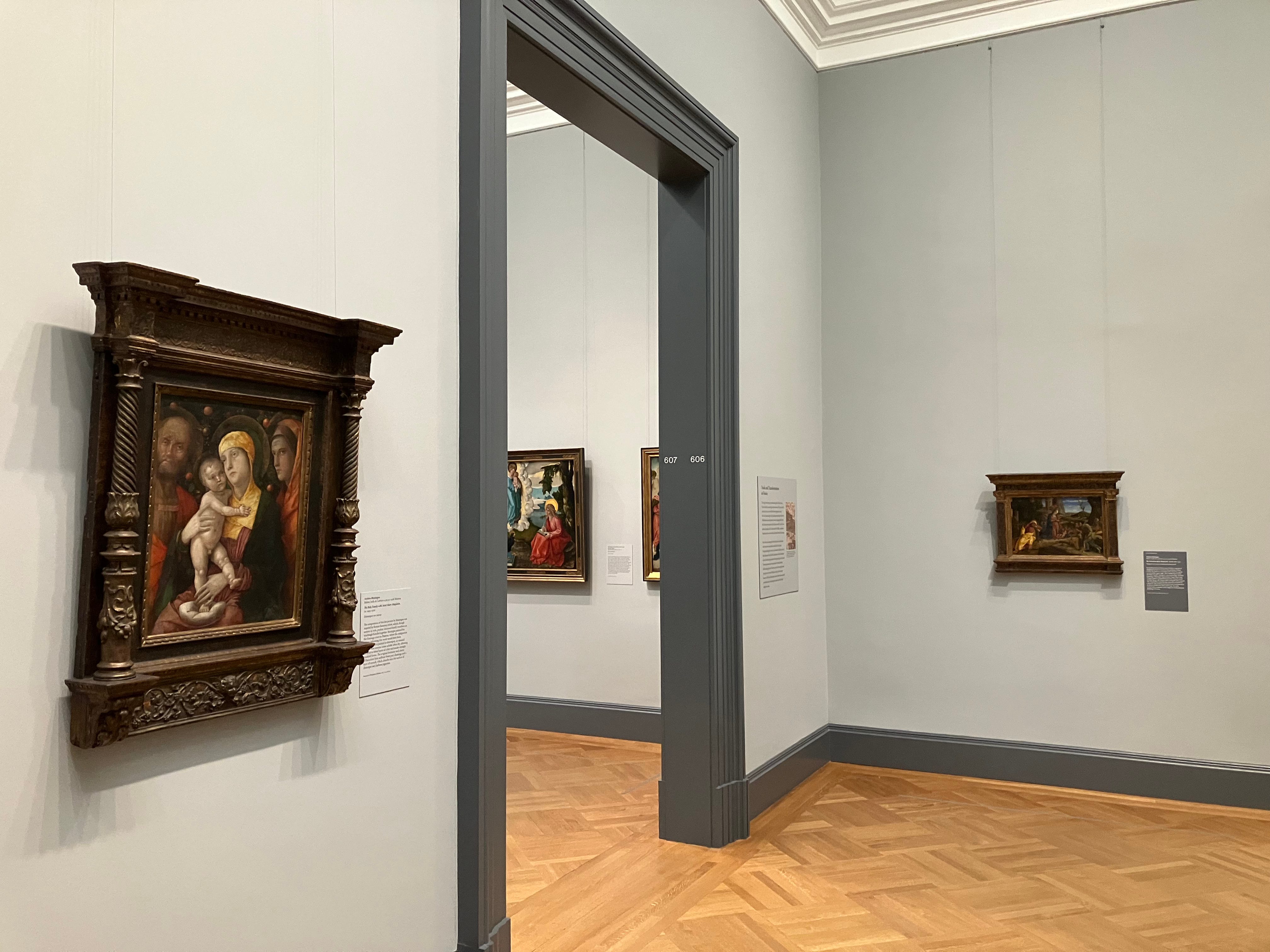
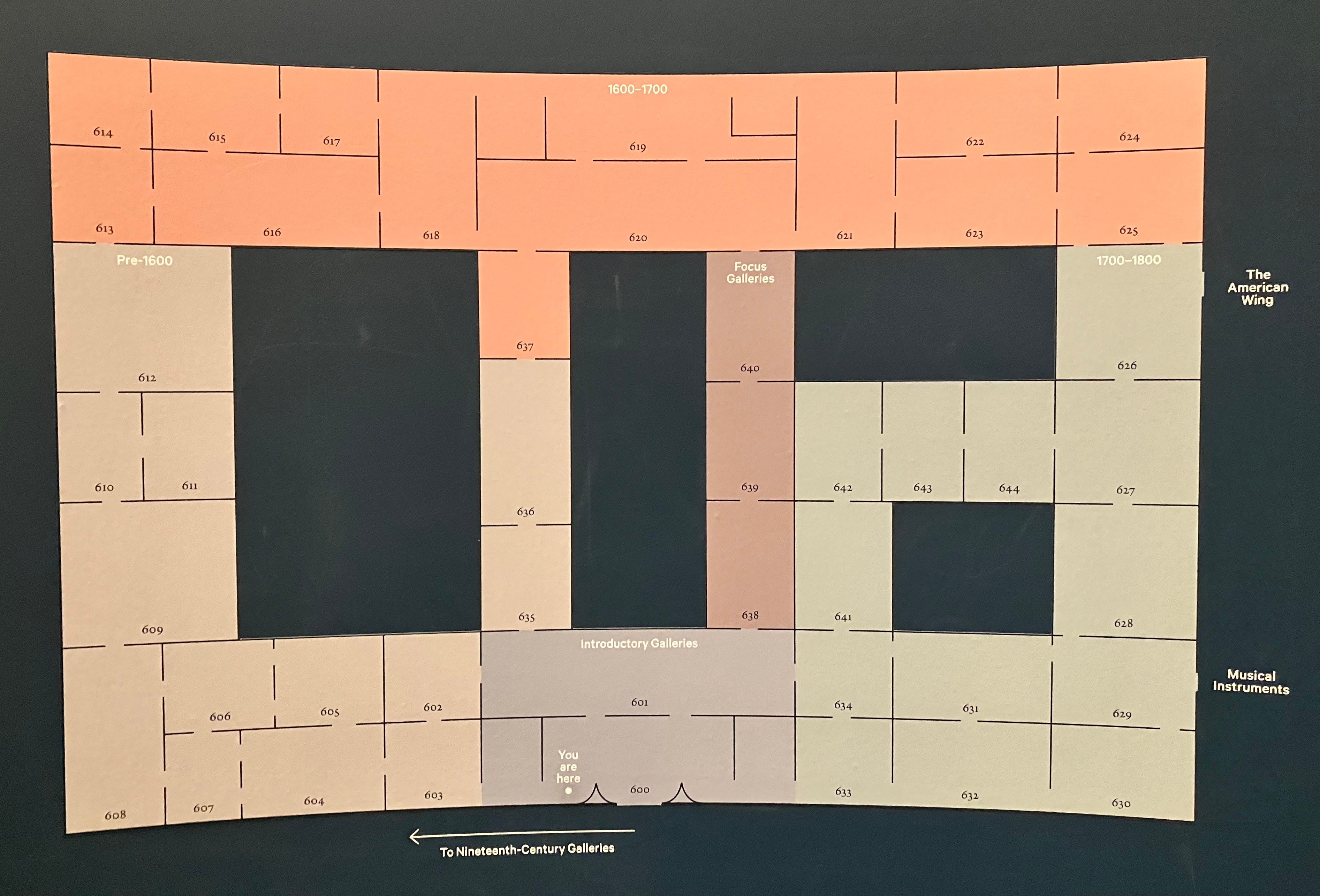
Instruction. On the whole, fine. The sequence is chronological. Counting from the map below, which is color-coded by century, there are two introductory galleries, thirteen for the period up to 1600 (light brown), fourteen for 1600 to 1700 (orange), thirteen for 1700 to 1800 (light green) and then three “Focus Galleries.”
But really there’s only one introductory gallery, the one you enter from the grand staircase (600 on the map), where the three big paintings of scenes from Roman history by Giovanni Battista Tiepolo are hanging, just like they were before. They’re part of a set of ten that Tiepolo made in the 1720’s for the Palazzo Dolfin on Venice’s Grand Canal, around the time the city began its transition to a tourist economy.2 A couple of ‘global’ objects, including an impressive Mexican lacquerware tray and a Gandhara bodhisattva, have been added, along with wall text about the shifting meaning of Europe over time.
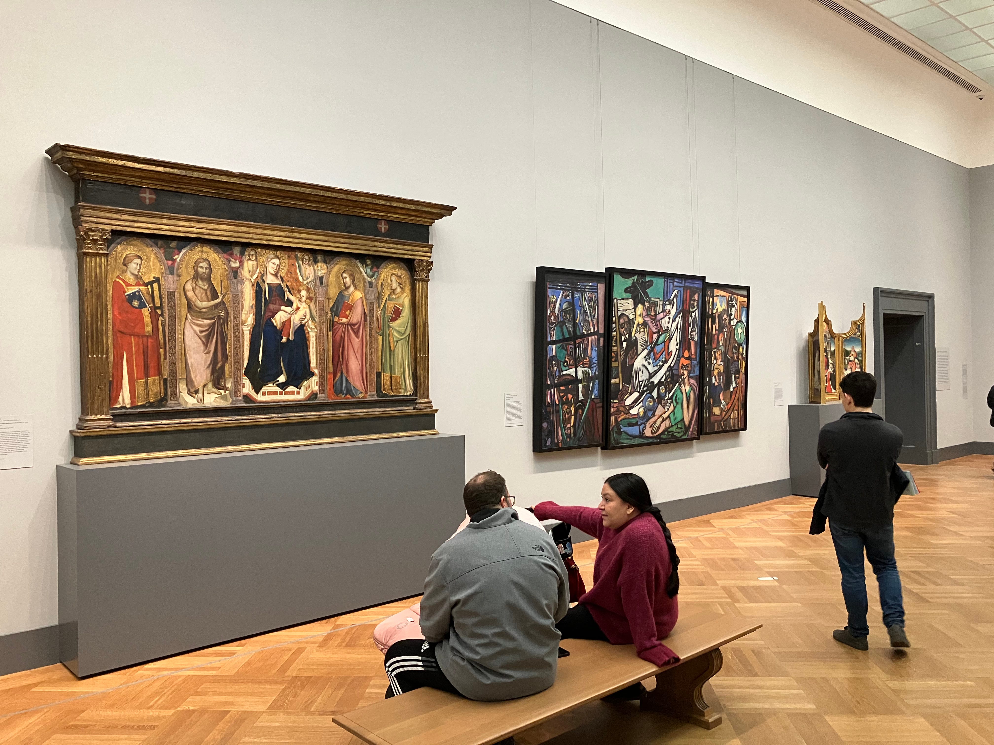
The next room (601) is almost all early religious paintings, big triptychs and the like, so it should be shaded as pre-1600 on the map. I’m thrilled by the decision to start this way. Not one of these works is famous, but they’re interesting, and they deserve the attention they’ll get in this large, prominent room. I said almost all early religious paintings—an exception is The Beginning, a late painting by the German Expressionist Max Beckmann, depicting early memories, a post-World War II recollection of a pre-World War I childhood.3 It’s a triptych: Beckmann’s use of the long outmoded format earns The Beginning a spot between Taddeo Gaddi and Jean Bellegambe. I enjoyed seeing it there, though I couldn’t help wondering, why not go all the way, and give him an old frame, too?
Each room has a name and a paragraph of wall text. Some of them, the simpler ones, are just right: International Gothic, The Home in Renaissance Italy, Artists at the Italian Courts, Reformation and the Age of Dürer. Sensible, clear, informative. Others are vague, pretentious, or trying too hard: Faith and Love in Venice, A Search for Truth in Lombardy, Flash and Spirit in the Age of Rubens. And like academics, curators are overfond of the word power. The Powers of Portraiture, Portraits and Power in Spain. Stop it.
This hardly matters though. The galleries make sense, even if their titles don’t always explain why. As ever, the Met is a great place to learn.
Inspiration. It would be hard to mess this up. As long as the works are not crowded too close together on the walls, or put into period rooms, or overwhelmed with didactic texts, visitors will find inspiration.4 MoMA on the other hand has a problem in this area, I’ll write about that another time.
Delight. What is a tourist supposed to do at the Met, anyway? You’re a couple from Calgary or Taipei or Gdansk, you’re in New York for eight days. Once you’re through the lines, and not counting a coffee break in the middle, you have two-and-a-half hours for the Met, three-and-a-half if you push yourselves. Of course you want to see the Temple of Dendur, and probably the Impressionists, some Greek and Roman stuff, maybe an exhibition. What else? Washington Crossing the Delaware? Noguchi’s Water Stone? Paul Klee? Who knows, the point is, there’s not much time for the forty-five rooms of pre-1800 European paintings, even if they’re your primary interest.
Luckily this is not a problem. As I said above, the Met’s collection is broad and deep, but unlike its counterparts in European capitals it only has a few paintings you shouldn’t miss. The Bruegel and Juan de Pareja for sure. A few more to make it half a dozen: the Goya portrait with the magpie and three cats, the perverse Lorenzo Lotto, the early Caravaggio, the View of Toledo. And even those, just wander around, look at what catches your eye, if you only see three of them, that’s plenty.5
Consolation. Of course it is the repeat visitor who will have the hardest time with the new arrangement. Nothing is where it was in 1997, or 2006, or 2015. Before the galleries closed there were separate sequences of rooms for Italian and Northern painting up to 1700. Now the two strands run together, hopscotch-like. I prefer the old way, but maybe I’m just being difficult. The hopscotch is defensible. Old timers will get used to it.
Provocation. It’s always renovation time at the Met. European paintings has reopened, but several other departments are fully or partially closed, including Modern and Contemporary Art, which is getting such a thorough remodeling that most of its galleries are closed until the end of the decade. When I said above that I’m a fan of the caprice of putting the Beckmann triptych with paintings that predate it by five centuries, in part that’s because I know that eventually it will go back where it belongs. The same is probably true of the Kerry James Marshall that dominates the first of the three “Focus Galleries,” which is devoted to artists’ depictions of studios. There’s also a Matisse, an Elaine de Kooning, and a self-portrait by an Irish painter, William Orpen, c. 1910. A mirror self-portrait, in fact, a much-favored type in our own times. Once you start looking at Orpen, in his mirror, it’s hard to stop. He seems like the sort of cool character you might find a fictionalized version of in an Anthony Powell novel, the lover of a woman the narrator is infatuated with, or something like that. These modern visitors to the galleries are all welcome.
The other two of the three Focus Galleries are not quite as much fun, more scholarly. One has oil sketches. The star here (for me) is Tintoretto’s Doge Alvise Mocenigo Presented to the Redeemer, a study for a large wall painting in the Doge’s Palace in Venice. You can see war ships out the window behind the doge, getting ready for the Battle of Lepanto (they didn’t make it into the final version). The other displays paintings made on nonstandard supports—copper plates, slate, linen, plaster. Solid niche stuff.
Finally, and this is the only one of the experiments that I condemn, in the El Greco room (El Greco and European Modernism) there are three Picassos and a Cézanne. Not that the connection isn’t real; the problem is that the Spanish paintings have a special status in the collection. There aren’t that many of them, only enough for four galleries, but they’re a strong group best shown together. The El Grecos shouldn’t be several galleries from the Murillos and Zurbárans and the rest, which in turn shouldn’t be hidden away in the least-trafficked corner of the department (Rooms 624 and 625). And the seventeenth and eighteenth centuries should border each other in a way that allows the Goyas to be near the others.
What I really think
So far (apart from the jibe about the word power) I’ve tried to be even-handed. The views I’ve expressed have been mine, but I’ve also been courting consensus, so I haven’t yet touched on what I felt strongest about. I’ll do that now. There’s one gallery that’s a disaster, one with a stroke of genius, one that especially pleased me, and one that’s in the wrong part of the museum.
A disaster
I started out by saying that if you fall for Mantegna in New York, you’ll probably want to go to Paris. In the case of Pieter Bruegel the Elder, wherever you fall for him, even if it’s in Vienna or Brussels, you’ll soon feel the lure of The Harvesters at the Met. Full disclosure, I’m talking about myself—it’s the best painting in the museum, the city, the country, the continent, the hemisphere. As such, it should be the most prominent work of whichever gallery it’s in, and there should be a bench in front of it. Some paintings are best seen from bench distance; some ideally viewed from as close as you can get. The Bruegel works both ways. Take it in from the bench, then get up and peer at details, then sit down again. If you can—they’ve put it in a small room called Origins of Landscape, and not in the center, either. The bench, instead of facing The Harvesters, looks onto the two Piero di Cosimos, which are stacked. It’s still possible to sit and look at the Bruegel, but only one person can do so at a time, from a narrow side of the bench.

Why do the Piero di Cosimos have the long side? Not that they don’t merit it, I have only admiration for the eccentric Piero, but it wouldn’t help, these are paintings to get close to.6 The bench is useless. And why are they stacked? You get a good look at A Hunting Scene but the upper one, The Return from the Hunt, you can barely see. Meanwhile The Penitence of Saint Jerome by Joachim Patinir, predecessor of and natural complement to Bruegel, is crammed into a corner.
Things get even worse when you consider the smaller paintings hanging between the ones I’ve mentioned. Christ’s Descent into Hell, by a follower of Bosch, would be better placed six galleries away in the room called Early Netherlandish Painting, where it could be shown next to The Adoration of the Magi, by Bosch himself. Still worse, between the two Piero di Cosimos (dated as c. 1494–1500) and the Bruegel (1565) is Kerstiaen de Keuninck’s A Mountainous Landscape with a Waterfall, painted around 1600.
None of it makes any sense, and the paintings in this room are too good and interesting (and popular) to be messed around with like this. Debacle! Back to the drawing board.
A brilliant conceit
I’m relieved to be able to report that there’s another room that’s as right as the Bruegel one is wrong. As well as the three big Tiepolos from the Palazzo Dolfin the Met has a fourth one, The Glorification of the Barbaro Family, from a ceiling in the Palazzo Barbaro, also in Venice. It now occupies one wall of a room titled Immersive Interiors/Pastels. As the name promises there are a few pastels nearby, but they are not the main attraction here and you are unlikely to give them much attention.
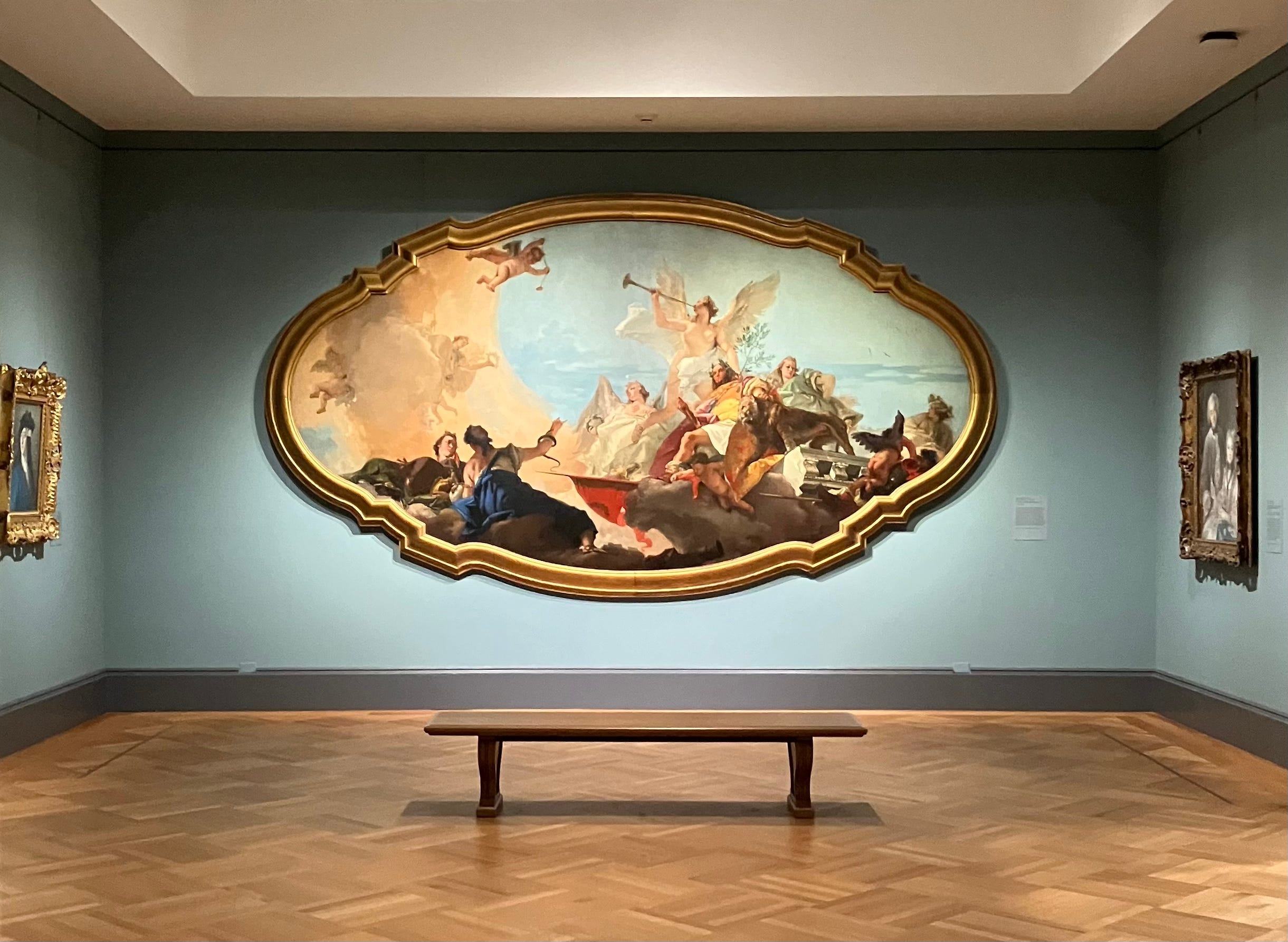
The Glorification of the Barbaro Family would look good anywhere, but in this little room it becomes something more, a radiant entertainment, a cinema, a fantasy to get lost in. I was tempted not to give its name, because what does it matter what’s going on here, who these figures are, what they’re up to. Information is almost beside the point.
Tiepolo painted lots of palace ceilings. You weren’t meant to get close; you were meant to crane your neck. That you don’t have to, that you can sit down on the bench, let your eyes rest here or there, is reason enough to be grateful to live in the twenty-first century. Try to sketch it, if you like. The first thing I noticed when I did this was that even the frame is tricky to draw.
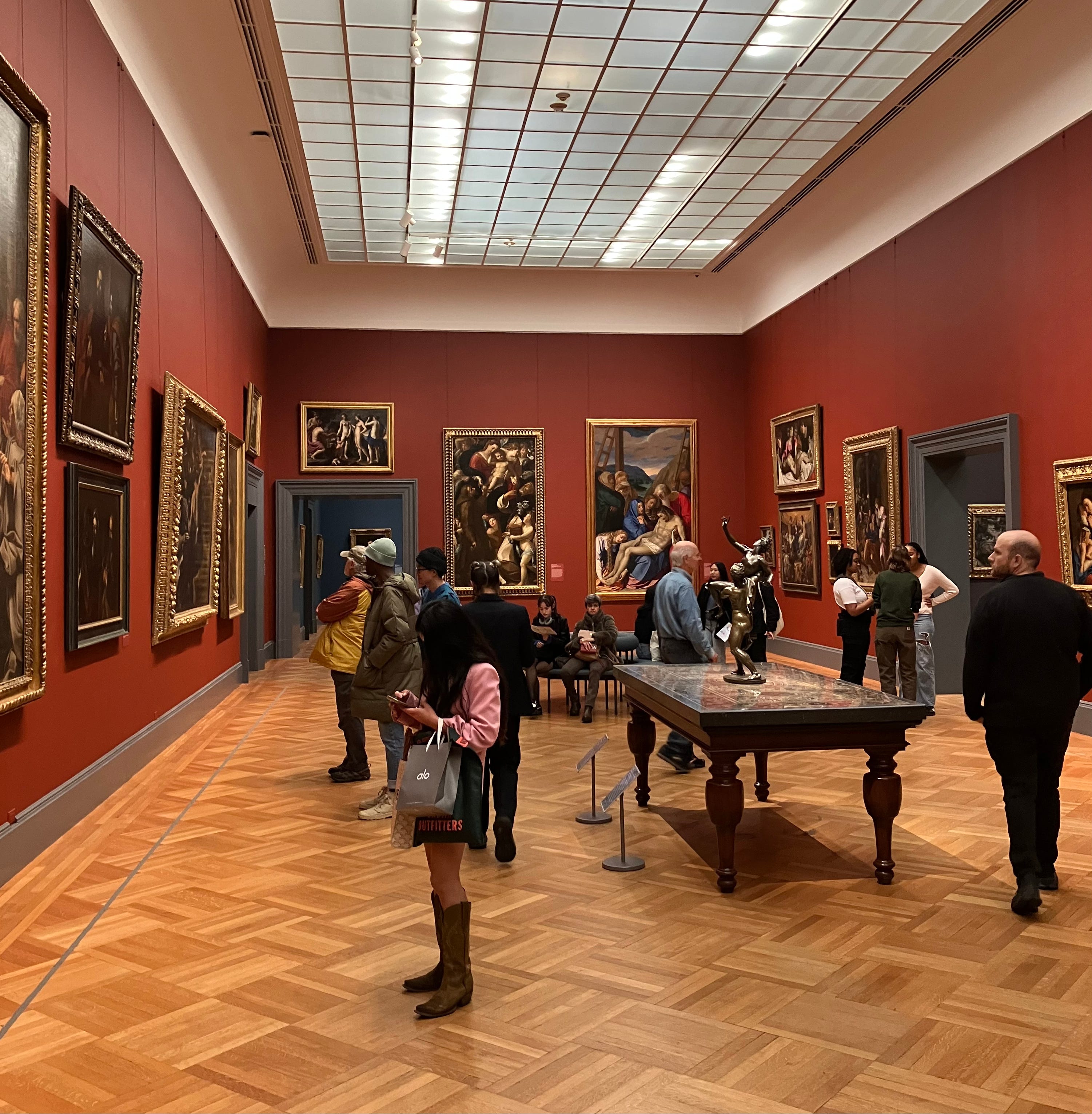
The big Baroque gallery
If you pore over the map enough you’ll notice that away from the introductory galleries there’s one other room that every visitor is sure to pass through, likely more than once—I refer to Room 620, which has six doors that open to five different galleries. In another era this prime spot could only have gone to the Italian High Renaissance or the Dutch Golden Age, but now it’s been given to the Italian Baroque, a collection that didn’t even exist a few decades ago.
I’ll share a bit of inside information. You can learn from an object’s wall label what year it entered the museum, it’s in the accession number. For example, Guercino’s Samson Captured by the Philistines is 1984.459.2. Converted into prose: the painting entered the museum in 1984 as part of the 459th purchase, legacy or donation of that year, and it was the second object of its group to be catalogued.7
Thanks in part to the disdain of the likes of John Ruskin, Henry James and Bernard Berenson, the Italian Baroque was out of style in the Gilded Age.8 The Frick Collection, down Fifth Avenue from the Met, has twenty-five Italian paintings, twenty-two from the period up to 1575 and then, from the eighteenth century, a Tiepolo and two Guardis—but nothing in between. Frick, Morgan, Andrew Mellon; these guys were never tempted by Guido Reni. I checked the accession numbers for the thirty-three paintings in the room. Bandits on a Rocky Coast, a small landscape by Salvator Rosa, has been in the museum since 1934. The rest arrived in the fifties or later. Twenty-four since I was born in 1975; sixteen in this century. You’d never guess if you didn’t know. The room, inevitably given its crossroads status, is often full of people. When I was there they seemed enthralled, happy. A wicked wish: if only Ruskin, James and Berenson could see them.
Wrong continent, wrong department
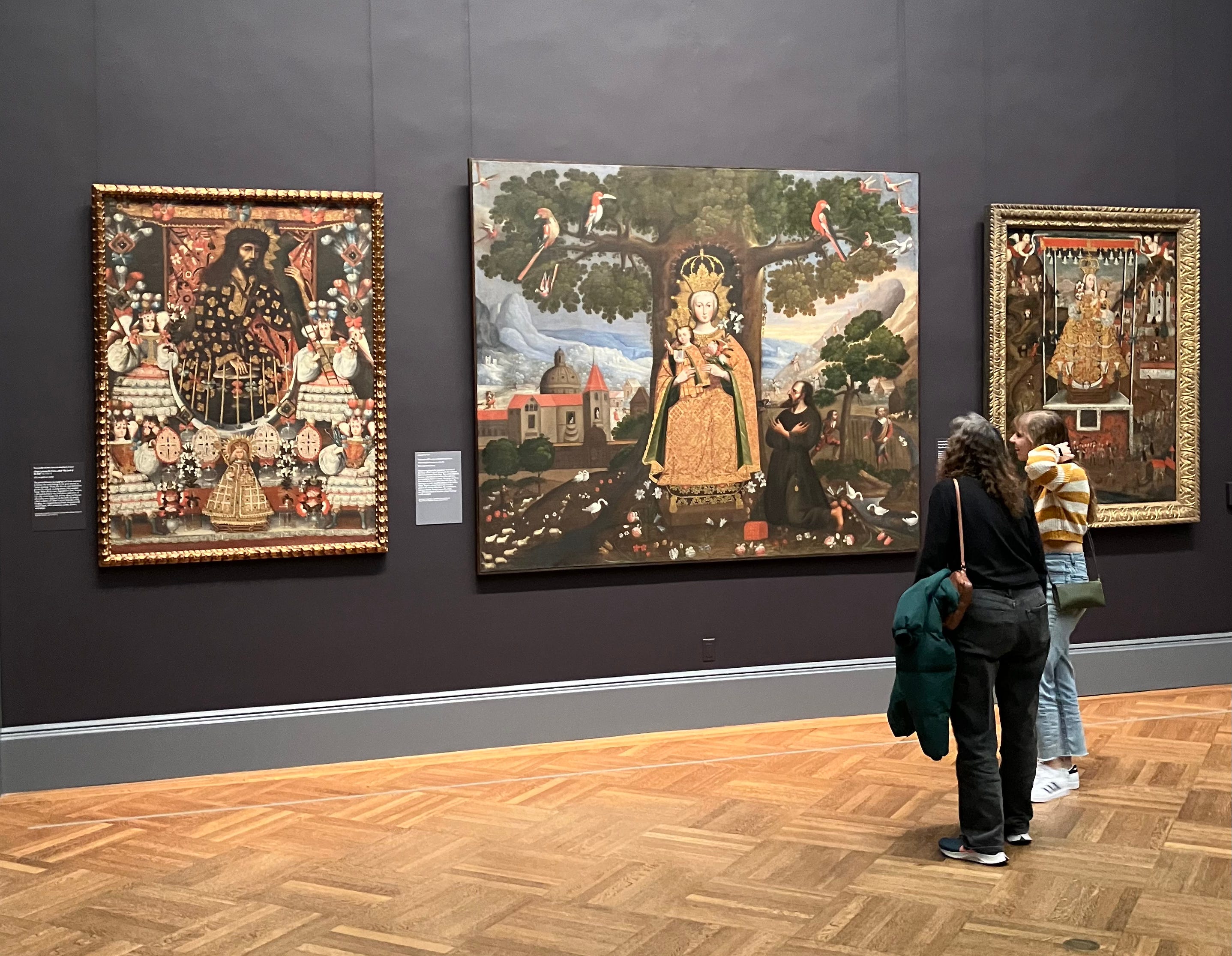
Sometimes people call me European because I wear a scarf or whatever. As if Europe were a state of mind, or a way of living. I’m sorry, no. It’s a place. I’m as American as apple pie. So are the colonial Mexican and Peruvian objects in Gallery 626. Together they make a magnificent group, a prize collection for the museum that’s even newer than the Italian Baroque one (median year of accession: 2018). But put them back in the American wing where they belong.
I doubt I have this exactly right, quoting from memory, from a review (I haven’t read the book).
The remainder are divided between the Hermitage in St. Petersburg (five paintings) and the Kunsthistorisches Museum in Vienna (two paintings). Tiepolo’s ceiling fresco is still intact in the Palazzo Dolfin, now part of the Ca' Foscari University. The Met had a good Bulletin on the series in 1998; the PDF is free on their website.
The other exception, in my view less successfully mingled with the older works, is another triptych, Francis Bacon’s Three Studies for Self-Portrait, from 1979.
Nothing against period rooms, but it’s harder to be struck by an artwork in one, and no accident that museums rarely surround their first-rate works with furniture, porcelain, boiserie, etc. You’ll never again get as good a look at the Frick Collection as you can now, when it’s hung in the bare rooms of the Breuer on Madison. You have until March 3.
In fact Caravaggio’s Musicians are in Toledo, Ohio until April 14. So for now, unless your next stop is Toledo, the best case scenario is five of the six.
Or at least Vasari calls Piero eccentric. “And in truth, in all that there is to be seen by his hand, one recognizes a spirit very different and far distant from that of other painters, and a certain subtlety in the investigation of some of the deepest and most subtle secrets of Nature, without grudging time or labour, but only for his own delight and for his pleasure in the art. …he cared nothing for his own comfort, and reduced himself to eating nothing but boiled eggs, which, in order to save firing, he cooked when he was boiling his glue, and not six or eight at a time, but in fifties; and, keeping them in a basket, he would eat them one by one.”
We can infer that there’s a 1984.459.1, otherwise the .2 wouldn’t exist. But just from the label there’s no way to know if there’s also a .3, a .4, etc.
Ruskin: “…my working men would not be allowed to look at a Bolognese Picture.” James: “I found myself scowling most unmercifully at Guido and Domenichino.” Berenson: “We turn away from Guido Reni with disgust unspeakable.”
This is the best thing I've read about the new galleries, really well-observed. I've twice done a sort of forced-march-for-first-impressions through them after seeing the Manet show and the Barbaro Family was what stood out to me the most as well.
I should go see them Friday and post another comment here to see if I agree with you.
A brilliant idea for a Substack, and I've thoroughly enjoyed what I've read so far. Keep these long, keep them full of links and photos, please. Funnily enough, I've just written some sentences about how MoMA really screws over the artworks in its Surrealism gallery having the Matisse room adjoin it—when The Red Studio is on display, anyway. The Surrealist stuff, much of which I admire, seems so silly and try-hard in retrospect when you turn the corner and get walloped by The Red Studio. A request: Would you write 1k words sometime about why The Harvesters does it for you?