


Harvard Art Museums in Cambridge, Massachusetts

It’s Museums rather than Museum because officially there are three of them. First there was the Fogg, which opened in 1895. William Hayes Fogg, born in Maine in 1817, had done well in the Eastern trade—clipper ships, tea, silk, “oil for the lamps of China,” and so on. The bequest to Harvard for a museum in his name was from his wife, Mrs. Elizabeth Fogg.1 Next, in 1903, came the Germanic Museum, with funds from the brewer, Adolphus Busch, and art from his son-in-law, the collector Hugo Reisinger. Much later the Arthur H. Sackler Museum was built to create a separate space for Harvard’s Asian art and antiquities. It opened in 1985.
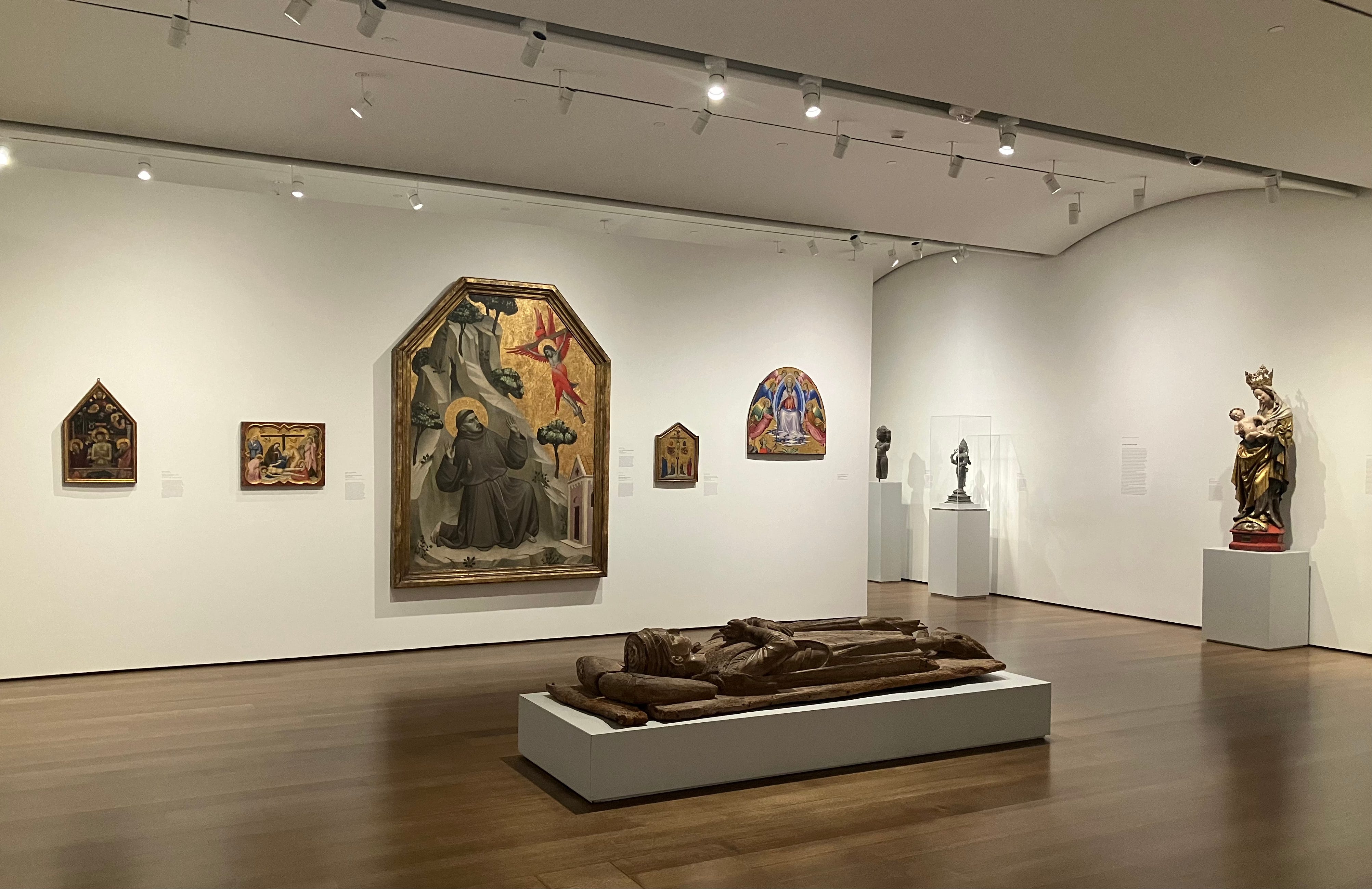
The three have been under one roof since 2014, when Renzo Piano’s expansion of the previous Fogg building was completed, but the old names are still in use. You see them on the website, and on the wall labels, which categorize objects as Fogg, Busch–Reisinger, or Sackler.2 In practice, however, you don’t really notice. Of all the museums I’ve written about this year, Harvard’s is the one that most seemed to be a coherent whole rather than a series of connected but distinct buildings.3
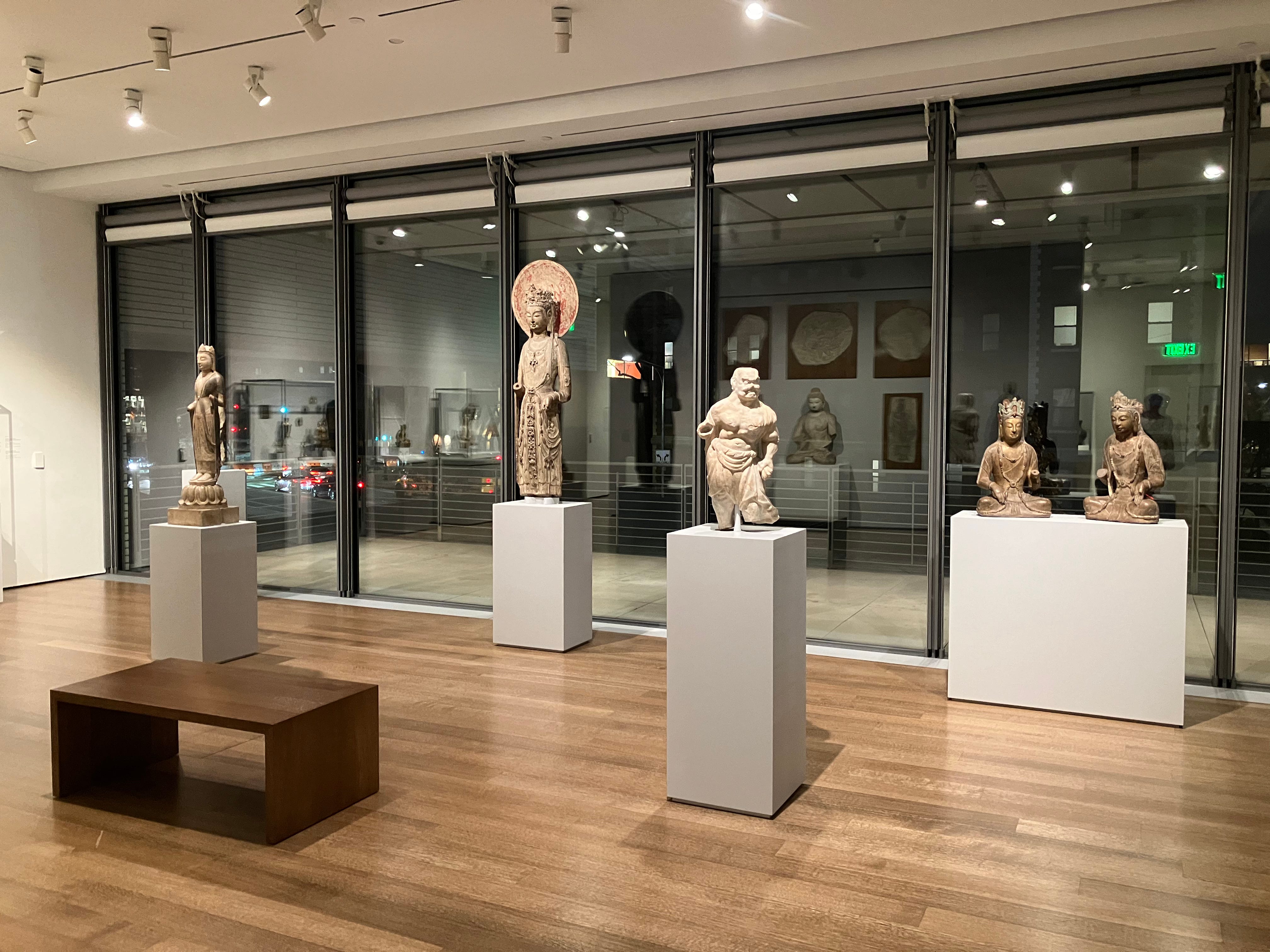
This is not an institution anyone will accuse of being stuck in the past. There’s space, there’s light, and most of all there’s glass. I don’t remember being in another museum with so many windows. Maybe there isn’t one. I was annoyed a few times, when vitrines were obscured by reflections, but mostly I didn’t mind, and in one ground floor gallery I was enchanted. It was after dark, I had the room to myself, and I liked the way the headlights of passing cars traced along the wall of windows behind a series of early Chinese Buddhist sculptures on pedestals. Ordinary time for the drivers, out there in the Massachusetts darkness, but a special moment for me, on my day trip from New York.
I had arrived hours earlier. I started with the University Study Gallery, on the top floor. University museums are often called teaching museums. Sometimes this makes sense—at the Penn Museum, thanks to all the didactic wall panels, it’s probably easier to learn about Greek numismatics, Roman glass or cuneiform tablets than it is at the Met. But is the Yale University Art Gallery a teaching museum? I can’t imagine how. The same goes for Harvard, except for the University Study Gallery, two rooms where the objects on view are connected to specific Harvard classes. My favorite was an eclectic set of prints and photographs that are being used for Beginning, Intermediate and Advanced Polish. Among other curiosities (an English portrait engraving of ‘Thaddeus’ Kościuszko, a German photograph of men at a fair in Augustów, Poland in 1978) there are eight images documenting the living conditions of Polish immigrants around the turn of the twentieth century, four from Chicago and four from Lowell, Massachusetts.
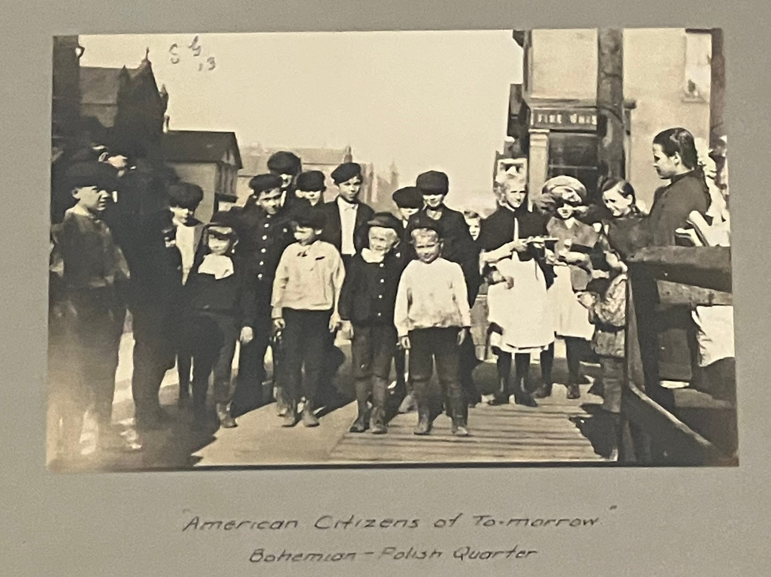
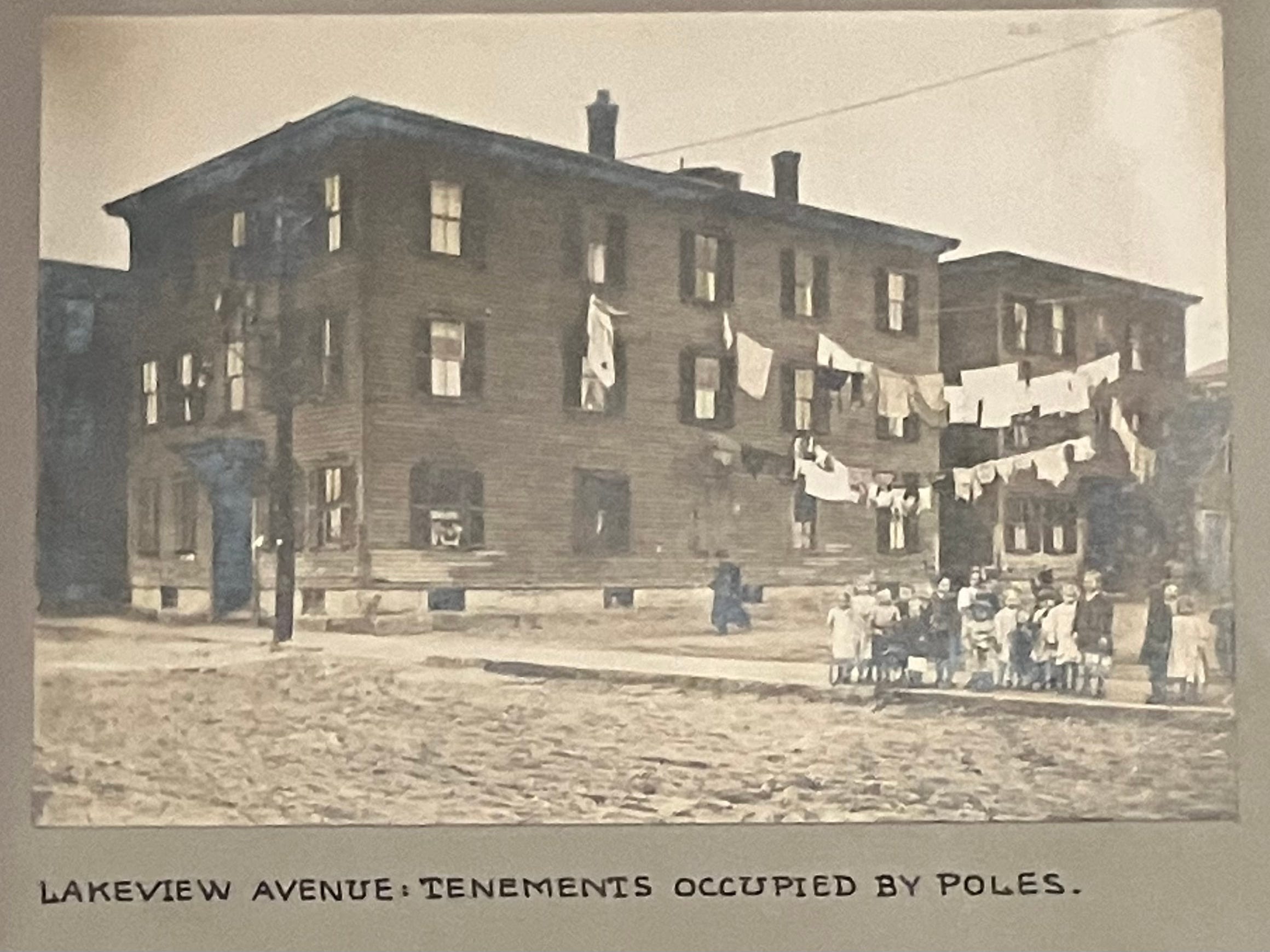

These formerly belonged to another Harvard museum, the Social Museum, founded by ethics professor Francis Greenwood Peabody in 1903 “to promote investigations of modern social conditions and to direct the amelioration of industrial and social life.” Thousands of photographs and ephemera were transferred to the Fogg from this collection in 2002. Many have been digitized; searching around in the archive I found more immigrant pictures from Lowell—Syrian tenements, the children of Lowell’s Little Canada and a view of “dangerous galleries overhanging the canal from Broadway Bridge.”4
By coincidence, a Polish class was getting started when I was there. Would it be devoted to a close examination of these pictures? To parsing distinctions between ‘Poles’ and ‘Russian Poles’? I’ll never know. I felt it would be unseemly to linger.
*
I suppose it was inevitable—having started this newsletter, sooner or later I would have to address the question of recent attempts to reconstruct ancient polychromy. Ancient polychromy has been having a moment. The eighteenth century reverence for unpainted marble is now seen as steeped in Enlightenment-style white supremacy, and some art historians feel that painted Classical deities are more than aesthetically provocative—they can be deployed in the service of antiracism. This is a subtext of the shows “Chroma: Ancient Sculpture in Color,” held at the Met in 2022 and 2023, and “Gods in Color,” which since its first display in Munich in 2003 has traveled to over two dozen museums, including to Harvard in 2007. Both “Chroma” and “Gods in Color” were created by the archaeologists Vinzenz Brinkmann and the late Ulrike Koch-Brinkmann, a husband and wife team who made full-color copies of ancient works after examining flecks of paint on the originals.
Harvard has a small but fine collection of reliefs from Persepolis, capital of the Achaemenid Empire. The most impressive of these, from the fifth century BC, portrays the winged Zoroastrian god Ahuramazda. It was in a room known as the Hall of the 100 Columns, part of a larger relief of the enthroned Xerxes I. The curation is impeccable—Ahuramazda’s missing wings have been stenciled onto the wall, and there’s also a diagram showing what the full ensemble looked like. But turn a corner into the next gallery and you’re confronted by a very different Ahuramazda, one that was created when “Gods in Color” was at Harvard in 2007.
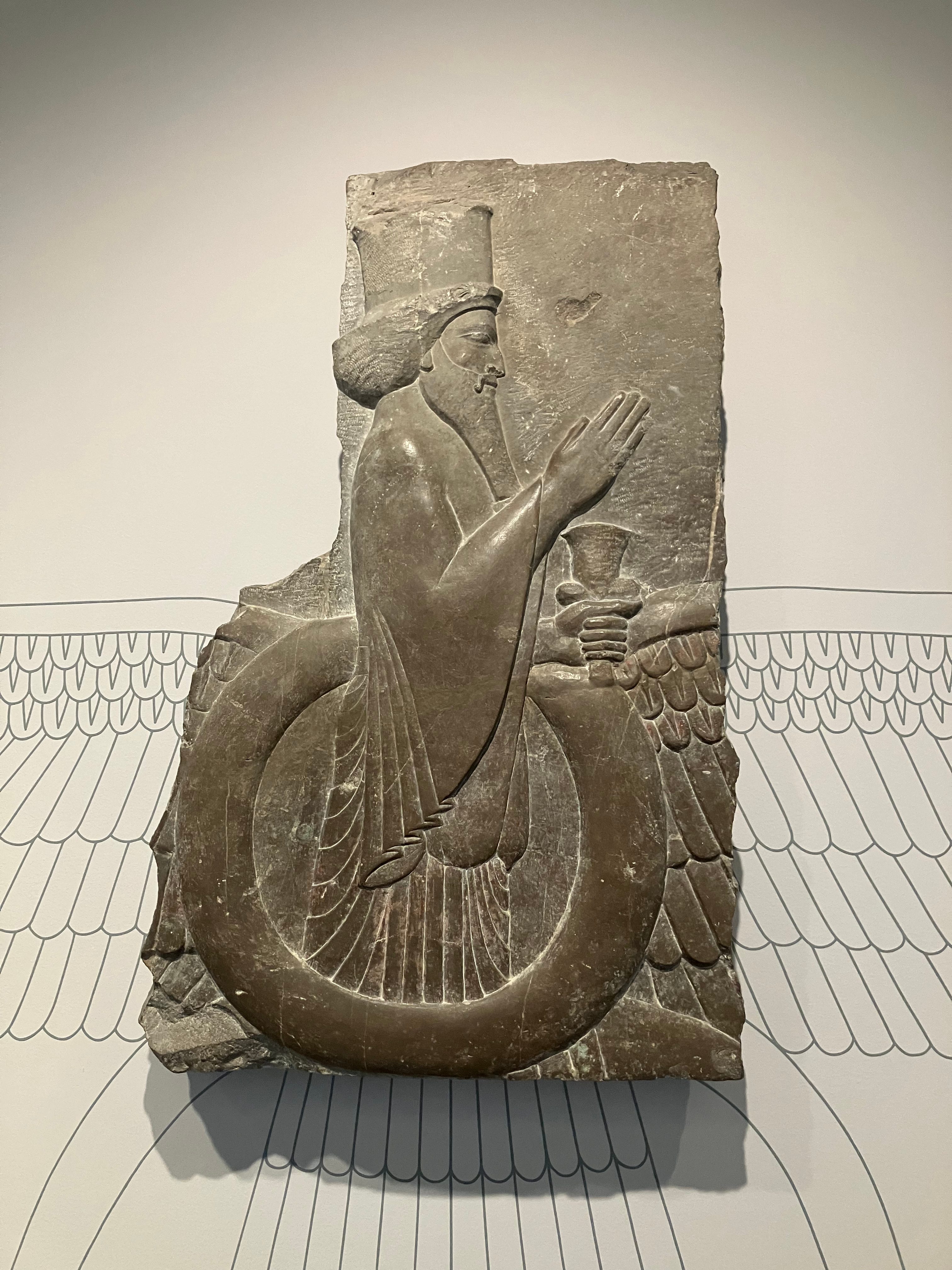
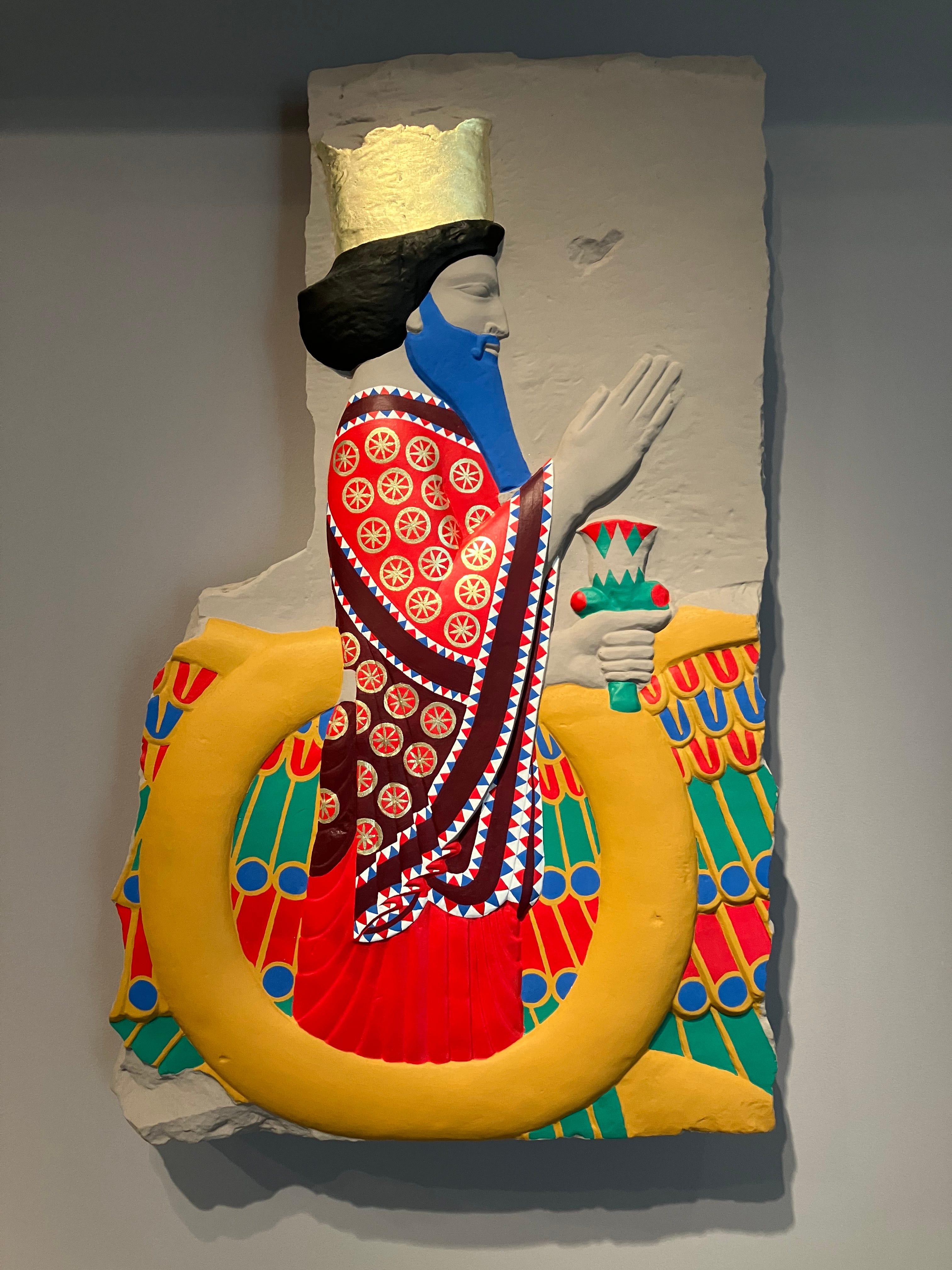
Journalists covering the reconstructions have noted the existence dissenting voices, not on the question of whether or not these works were painted, that’s settled, but about the Brinkmanns’ artistic choices. While preparing a profile of the Brinkmanns that ran in the New York Times on August 17, 2022, Zachary Small spoke to ten scholars, and found that “more than half said that the Brinkmanns have taken a heavy-handed approach to painting, choosing excessively bright hues that leave their reconstructions looking gaudy.”
Writing in the New Yorker in 2018 (“The Myth of Whiteness in Classical Sculpture”), Margaret Talbot quoted architectural historian Fabio Barry.
The various scholars reconstructing the polychromy of statuary always seemed to resort to the most saturated hue of the color they had detected, and I suspected that they even took a sort of iconoclastic pride in this—that the traditional idea of all-whiteness was so cherished that they were going to really make their point that it was colorful.
Barry is right. I cringe every time I see a Brinkmann sculpture. Could the reliefs of Persepolis have been painted with the sort of bright colors that one associates with children’s furniture from Ikea? Thanks to Mount Vesuvius, and to the special climate of Egypt and the burial practices of Ancient Egyptians, there is no shortage of ancient polychromy in museums. Maybe it was once brighter than it is now, but none of it ever looked like this.
The Harvard team that created the colorful Ahuramazda acknowledged as much in a study recently published in the journal Heritage.
The reconstruction has had its detractors, however, mostly on the grounds of its “garish” colors. As mentioned above, the selection of the hues used in this particular reconstruction attempt was not very scientific, but the problem is first and foremost in the eyes of the beholder, as it is a matter of taste and expectations.
A matter of taste—well, yes. Yes.
*
On its post-Covid reopening in September 2021—I note in passing that this was a year later than the Metropolitan Museum of Art’s reopening in August 2020—Harvard Art Museums launched “ReFrame,” an initiative to “inspire, challenge, and connect museumgoers,” and to encourage them to think about “which artists, which groups of people, and which cultures are seen or unseen,” The result amounts to a milder, more discreet version of the Brooklyn Museum’s “Towards Joy” show (which I wrote about last month). No iPads, no wall labels written by drag queens, no paintings hung low to the ground to invite the scorn of visitors. Many of the “ReFrame” wall texts are worthwhile, but I am unable to resist making mild fun of the label to a 1784 portrait of George Washington at Yorktown by Charles Wilson Peale.
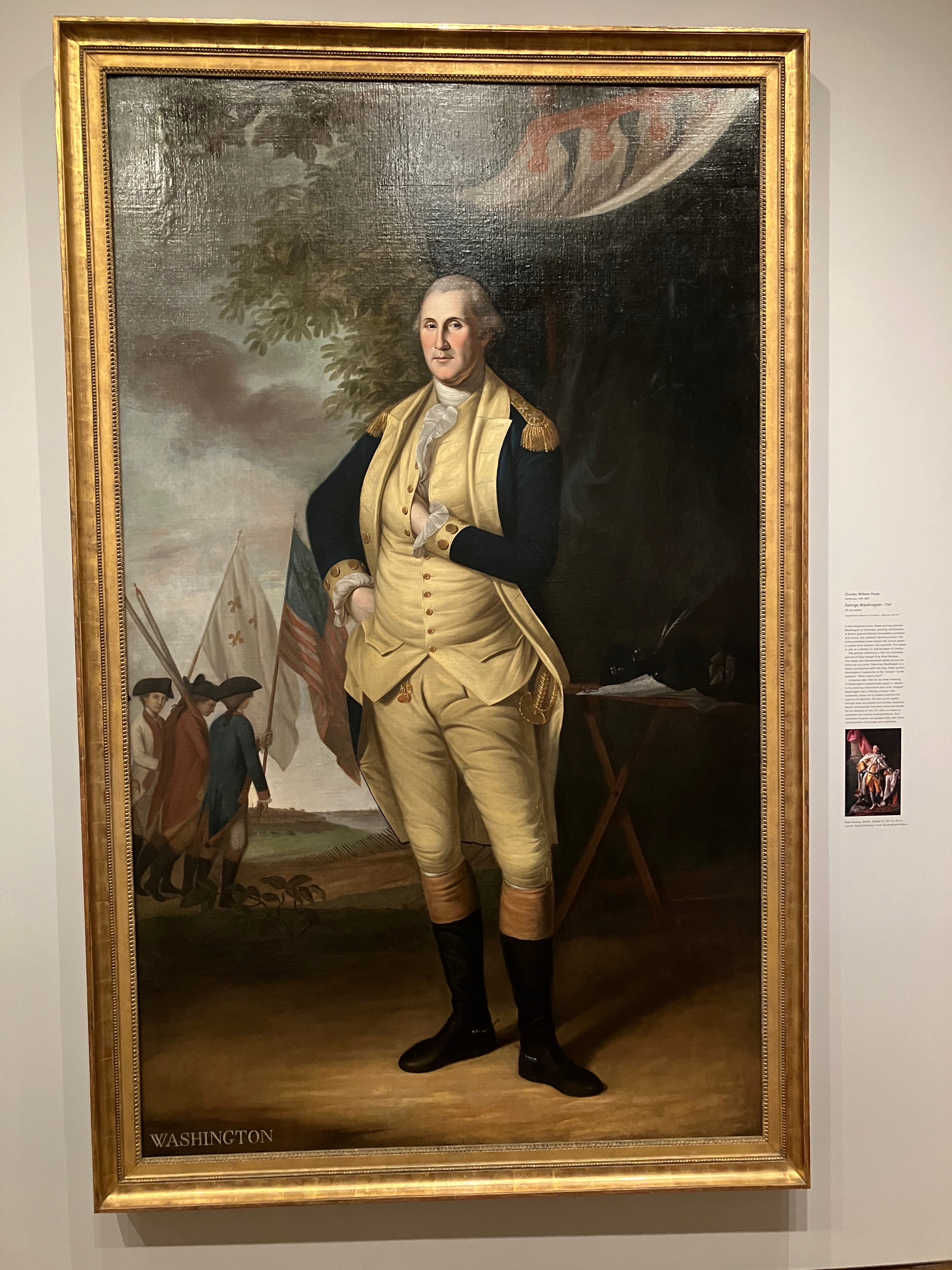
The label is on the long side, one hundred-eighty words in three paragraphs, and below the text there’s another portrait reproduced for comparison, Allan Ramsay’s George III. The first two paragraphs, which run to the respectable length of ninety-nine words, provide standard curatorial commentary. The eighty-one words of the third paragraph constitute the “reframing.” I applaud the museum for not paring down the first part to a minimum, so on the whole, not bad, except for one thing—here’s the last sentence.
As a university museum, we grapple daily with these contradictions of courage and cowardice.
“Grappling with contradictions” is garden-variety museumese. Maybe a shade too self-congratulatory, but twenty-first century museumgoers are used to such declarations, used to hearing from curators that they are troubled by the past, and its legacy in the present—we know that they grapple. But by specifying the interval, by announcing daily grappling, has Harvard not passed into the farcical? I remember by being struck, when I first started doing art history, by how much false praise there was in academia. If someone said a talk was interesting, they probably meant it, but if someone said a talk was very interesting, that might imply the opposite. With this in mind, I’m suddenly wondering if it takes any grappling at all to announce that the legacy of George Washington is complex. To shift for a moment from ‘grappling’ to ‘courage’—it would be courageous of Harvard to pick a side, that is, either to burn the painting, or else to display it without a revisionist wall text. But to take the middle of the road?
Not that Harvard is doing anything wrong here. The middle of the road is fine. Just, it’s probably also the site of least grappling.
*
But enough complaining. This is a wonderful collection, full of surprises. I’ll close with a few highlights and curiosities from my day at Harvard, none of which I knew about before my visit.
*
The most startling encounters for my students, when I take them to the Met, are with objects whose size they misimagined when they saw them in class. The krater from the Geometric period, the Nasca double-spout bottle with flying figure— I might tell them in lecture that one is big and the other small, but everything fits on a PowerPoint slide in the same way, and this Procrustean effect can lead to a surprised gasp in a museum.
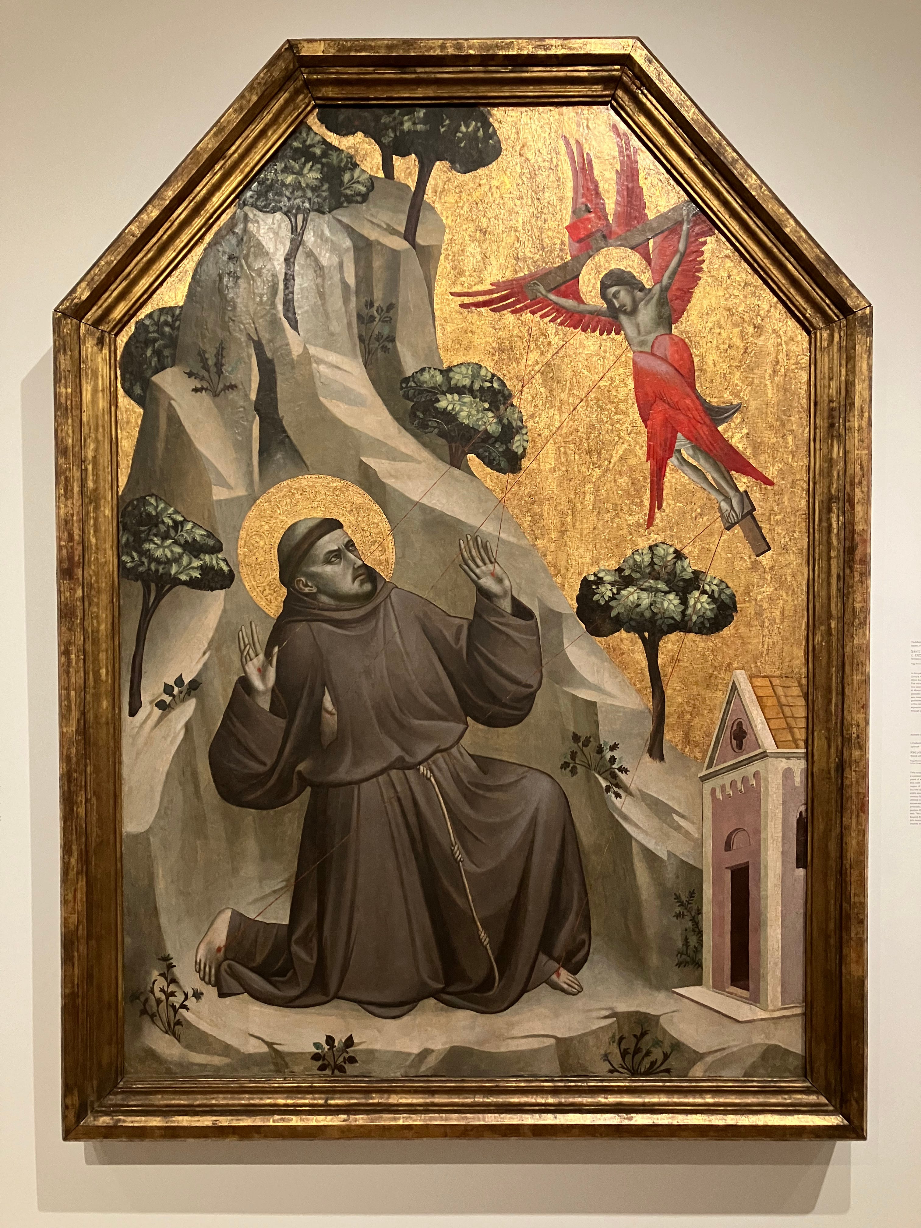
Going through the pictures I took at Harvard, I was struck in the opposite way by an early fourteenth century Florentine painting of Saint Francis having a vision of the crucified Christ, and receiving the stigmata.5 Most American museums have one or two works like this—gold background, landscape and figures charmingly out of scale, trees growing out of bare rocks. But unlike this one, which even without counting the frame is as tall as an NBA player, they’re generally small. And that’s how it seemed on my phone. I couldn’t make it assume its actual size in my mind until I looked at a second picture of the whole gallery
*
One of the less-known incidents in the life of Hercules is his enslavement for a term by Omphale, queen of Lydia in Anatolia. This was the humiliating punishment decreed by the Oracle of Delphi for his murder of the Argonaut Iphitus. Omphale took possession of Hercules’s club and the skin of the Nemean lion, dressed the hero in women’s clothes, and forced him to help her maids spin wool. Later she freed and married him. No version of the story survives in a Classical-era text, but it is mentioned in numerous Hellenistic and Roman works.
Like Judith and Holofernes, and Samson and Delilah, Hercules and Omphale were absorbed into the gender inverting Renaissance trope of Weibermacht, or Power of Women. The pair were a favorite of the German painter Lucas Cranach the Elder, or at least a favorite of his clients. At Harvard I saw one of the nearly twenty surviving versions produced by Cranach (or his Wittenburg studio) of a scene of Hercules, in a sort of bonnet, being teased and fussed over by Omphale and her maids as he holds a strand of yarn in his right hand. At upper left a partridge, symbol of lust, hangs from a hook, and a quatrain in Latin warns against succumbing to feminine allures.
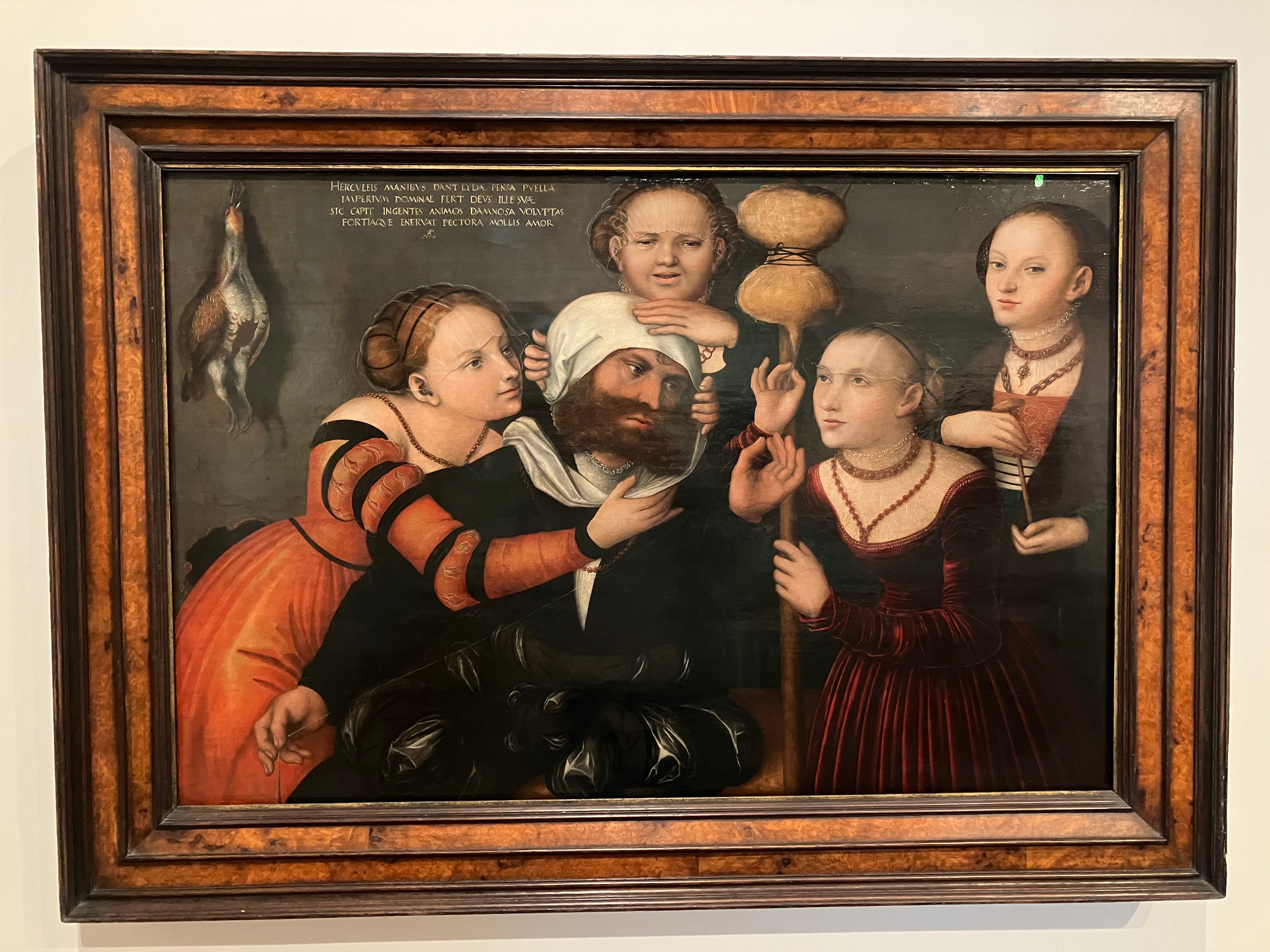
The label explains that “the mix of classical subject matter and eroticism would have appealed to the humanist members of the Saxon court.” Doubtless true, but why, I wondered, has Harvard played this one straight? Where are the “ReFramers”? If ever an early sixteenth century painting invited a queer reading, is it not this one? What if he’s having the time of his life? Hercules—what are your pronouns?
But it turns out the painting doesn’t belong to the museum. It’s a long-term loan from a private collection. Maybe you don’t play these games with someone else’s art.
*
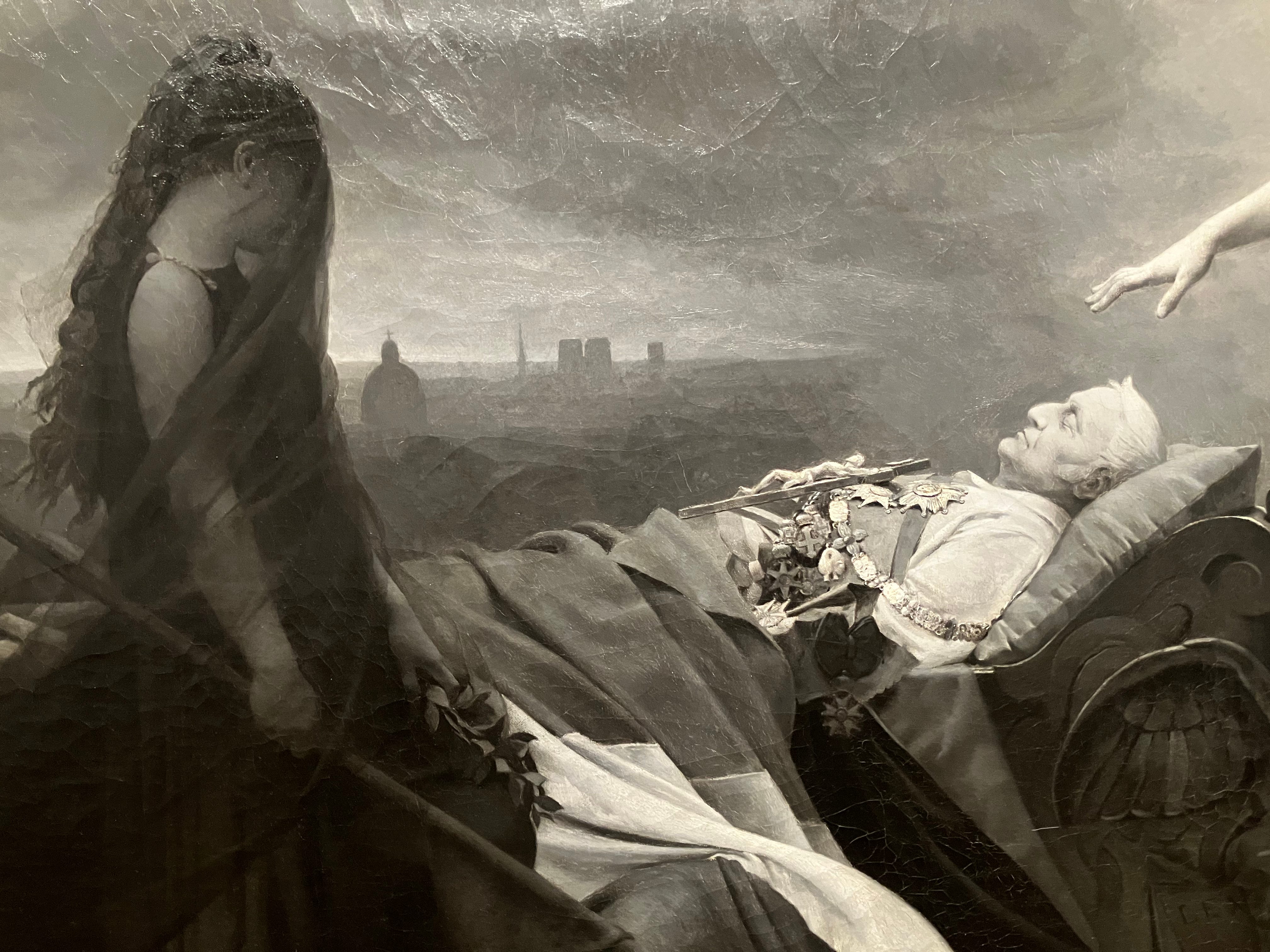
I’ve read enough about nineteenth century France to know the name Adolphe Thiers, but whatever I took in about him while reading this or that book, I soon forgot, so when I was confronted with Jehan Georges Vibert’s majestic grisaille painting of the apotheosis of Thiers, all I knew was that I was looking at a tribute to a politician.
The label informed me that this was the man who gave the order to suppress the Paris Commune. Wikipedia provided further facts. Thiers was briefly the prime minister of the Second Republic, and, following the Franco-Prussian War, the first president of the Third Republic. After scanning the rest of the Wikipedia page—Thiers was shown the sights of Rome by Ingres, he was one of the models for Balzac’s Eugene de Rastignac, and his reputation sank after May 1968, leading to a partial de-Thiersization of France, with streets renamed and statues removed—I took Pages from the Goncourt Journal down from the shelf. Five index entries for Thiers. The fifth one gave me—in the you know it when you see it sense—what I’d been looking for. On March 5, 1876, Edmond de Goncourt went to Victor Hugo’s salon.
Hugo spoke of the fascination of Thiers’s eloquence, composed, he said, of things everybody knew better than he did and of a host of grammatical errors, all this delivered in a most unpleasant voice, but which none the less, after an hour or so, took hold of you, aroused interest, forced itself upon you.
As for Vibert (who doesn’t turn up in the Goncourt book), this painting is so smooth, so photographically perfect, that I wonder if one might compare him to an American contemporary, John Henry. Henry had his duel with the steam-powered rock drill; academic painters like Vibert did battle with the camera. The future of painting may have belonged to the Impressionists, who opted out, but in the present this must have been an exciting competition.
The Harvard painting is a smaller version of a full-color original, a massive canvas shown at the Salon of 1878 and today in storage at Versailles. Harvard curator Elizabeth Rudy proposes that Vibert made the grisaille copy as a playful response to the print and photographic reproductions of the larger work that were sold at the time.
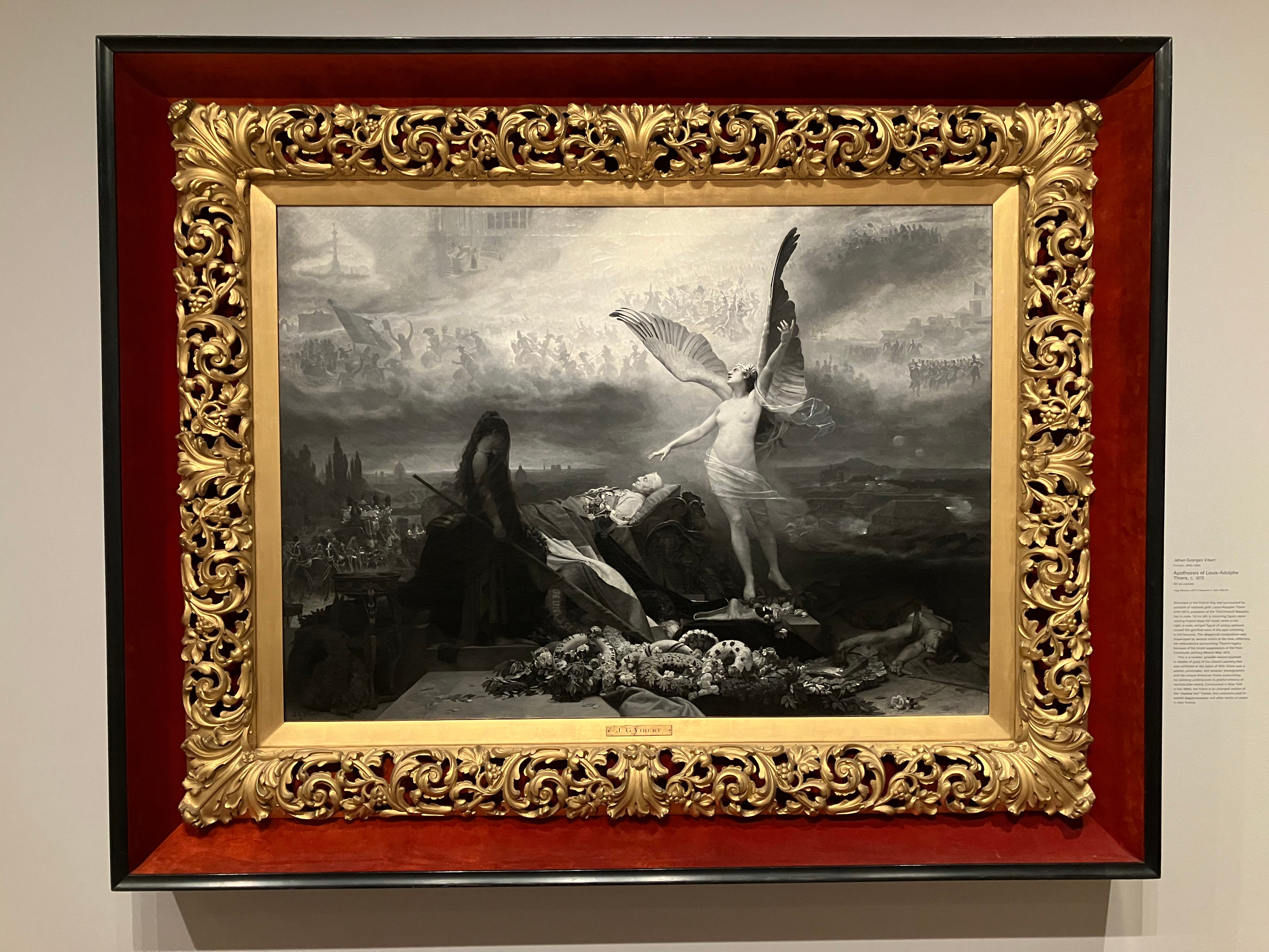
But what to make of it? Thiers is on a bier at center, his medals heaped on his chest. The figure in mourning to the left is the personification of France. To the right, Victory gestures to the heavens, which are filled with scenes of past French victories. The Parisian skyline stands out in silhouette against the glow of the horizon in the distance. It’s a grand performance, and if time has not been kind to such paintings, who knows, they may yet have their day. Stranger things have happened.
*
It’s hard to get a sense of what was in the Germanic Museum when it opened in 1903 because today’s incarnation, displayed in three galleries on the ground floor, is mostly modern. Two of the works on view, Max Beckmann’s Self-Portrait in Tuxedo and Franz Marc’s Grazing Horses IV, were among those that were sold on the international market after Joseph Goebbels ordered removed from German museums, and apart from Gustav Klimt’s Pear Tree and two or three others, the rest belong to the same category, what the Nazis called “Degenerate Art” (Entartete Kunst).
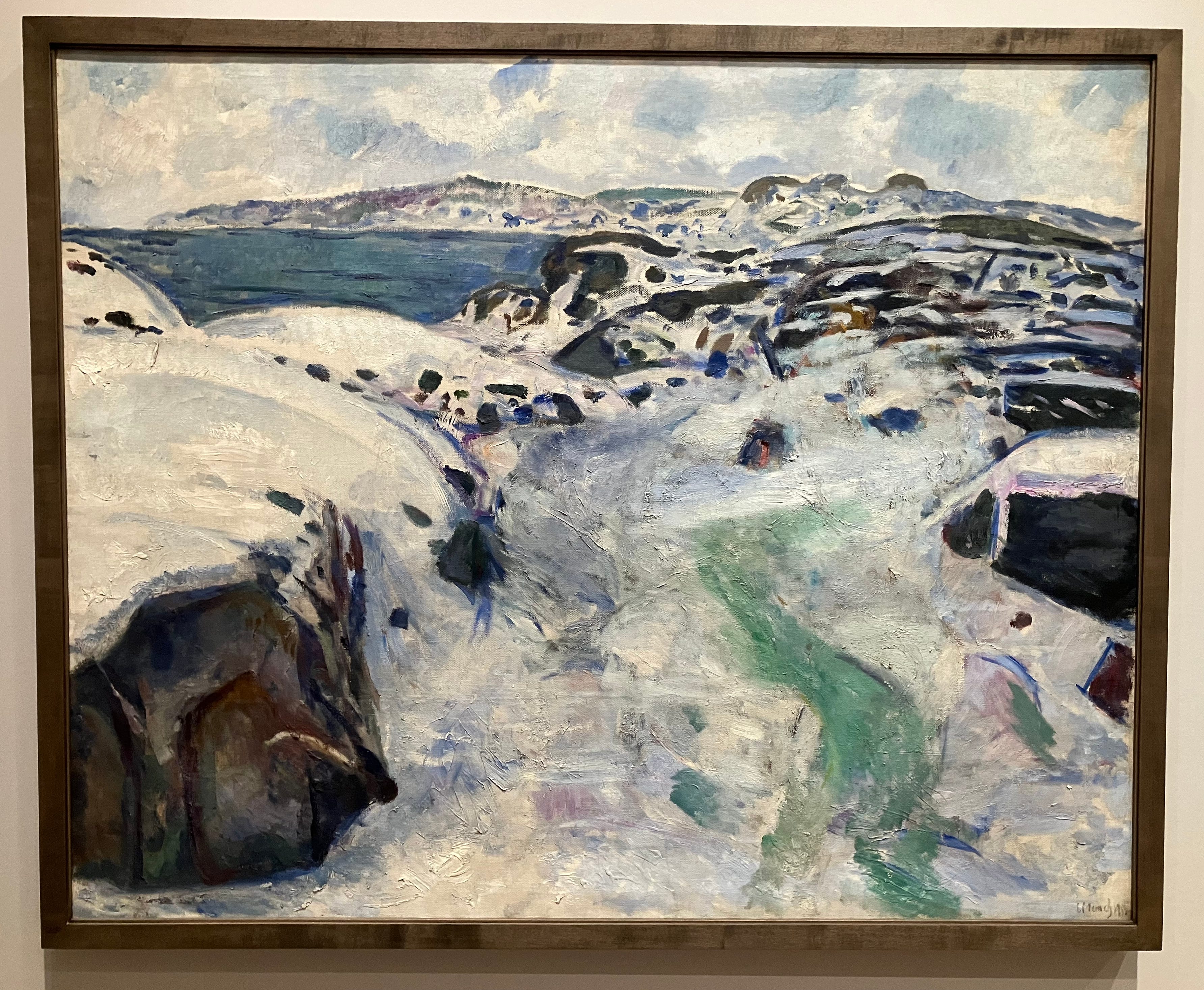
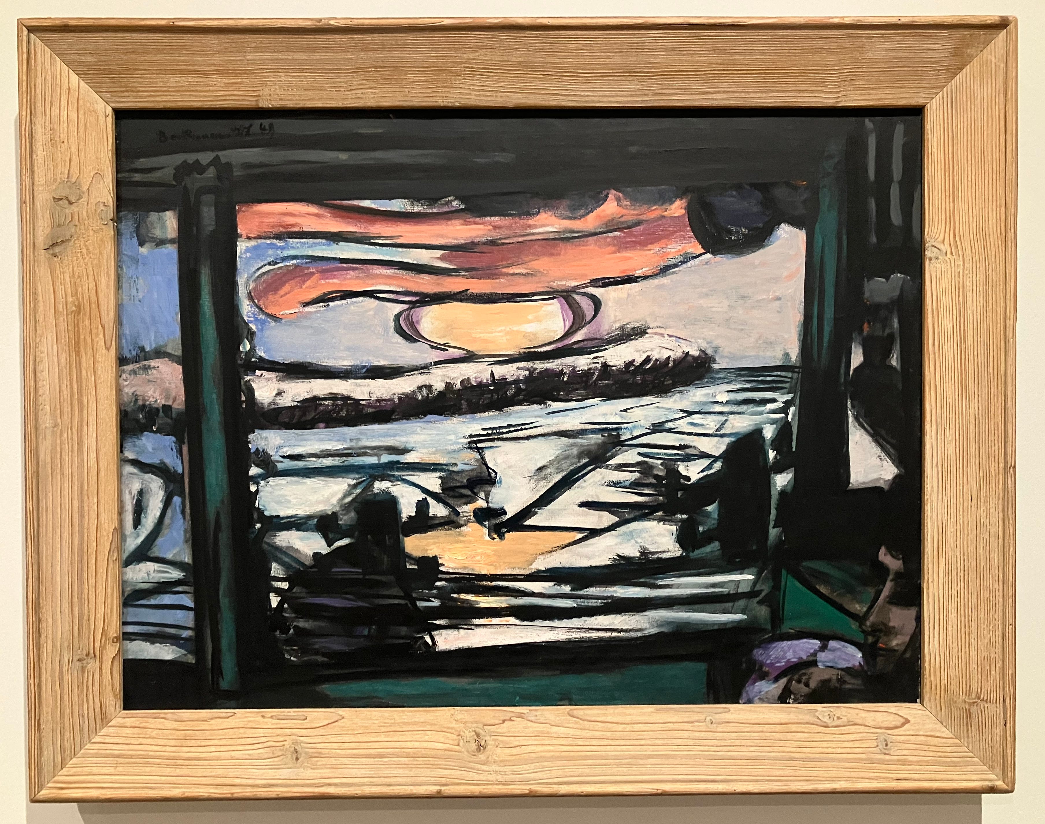
Germany’s loss was our gain is an obvious leitmotif of the American century, so I’m hardly covering new ground here, but then I don’t claim to be a grappler. It’s just true. Among my favorites were two winterscapes, one a snowy, rocky painting of the coast of Norway by Edvard Munch, and the other an unexpected Beckmann of a sunrise over an icy river, seen through the window of a train. I say unexpected because the river is the Mississippi—in the late 1940s Beckmann taught at Washington University in St. Louis.
And then there’s Proun 12E, a 1923 work by the Soviet painter and designer El Lissitzky. Proun is a Russian acronym—“project for the affirmation of the new.” I’m not sure what I would have made of it at the time, but, like so many paintings from the golden age of abstraction it looks great now that it’s an antique. (So much for the affirmation of the new.) In addition to the Prouns, Lissitzky, who said he worked “on the ground fertilized by the bodies of dead pictures and their painters,” is known for a famous propaganda poster, and for his “cloud irons.” These were cantilevered skyscrapers that he imagined for Moscow’s Boulevard Ring. Unbuilt, probably unbuildable.
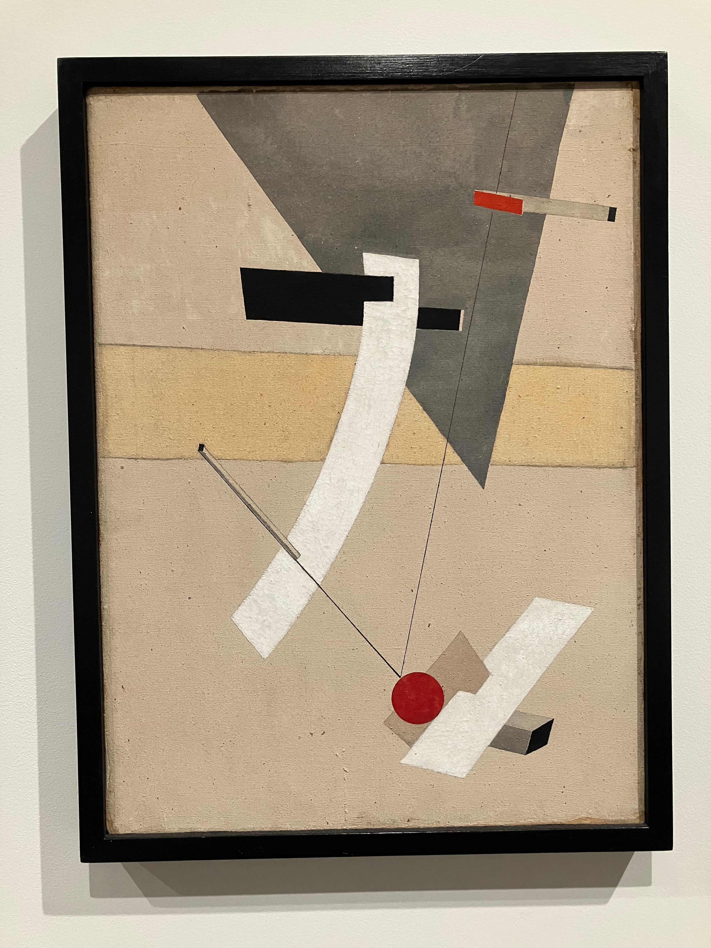
Proun 12E may have been painted in Berlin, where Lissitzky spent much of the early 1920’s as a Soviet cultural emissary. At some point it was acquired by Kurt Feldhäusser, a Nazi art collector with a taste for the Entartete. Feldhäusser died in the Allied bombing of Nuremberg in 1945; his collection, which also included many works by Marc Chagall and Ernst Ludwig Kirchner, passed into the hands of his mother, Marie Luise Feldhäusser. Marie Luise emigrated to America in 1948, taking her son’s art with her. The next year she sold much of it, including Proun 12E, through the E. Weyhe Gallery in New York.
Two of Feldhäusser’s Kirchners, one that was at MoMA and another from the Guggenheim, have been returned to the heirs of former Jewish owners forced to sell them to comply with the Reich Flight Tax, set up in 1931 to prevent capital from leaving Germany. Could the Harvard Proun, too, have been sold under duress by someone fleeing the Nazis? Maybe not—or what was the going rate for an El Lissitzky in 1930’s Berlin? I can’t imagine it was that much.
*
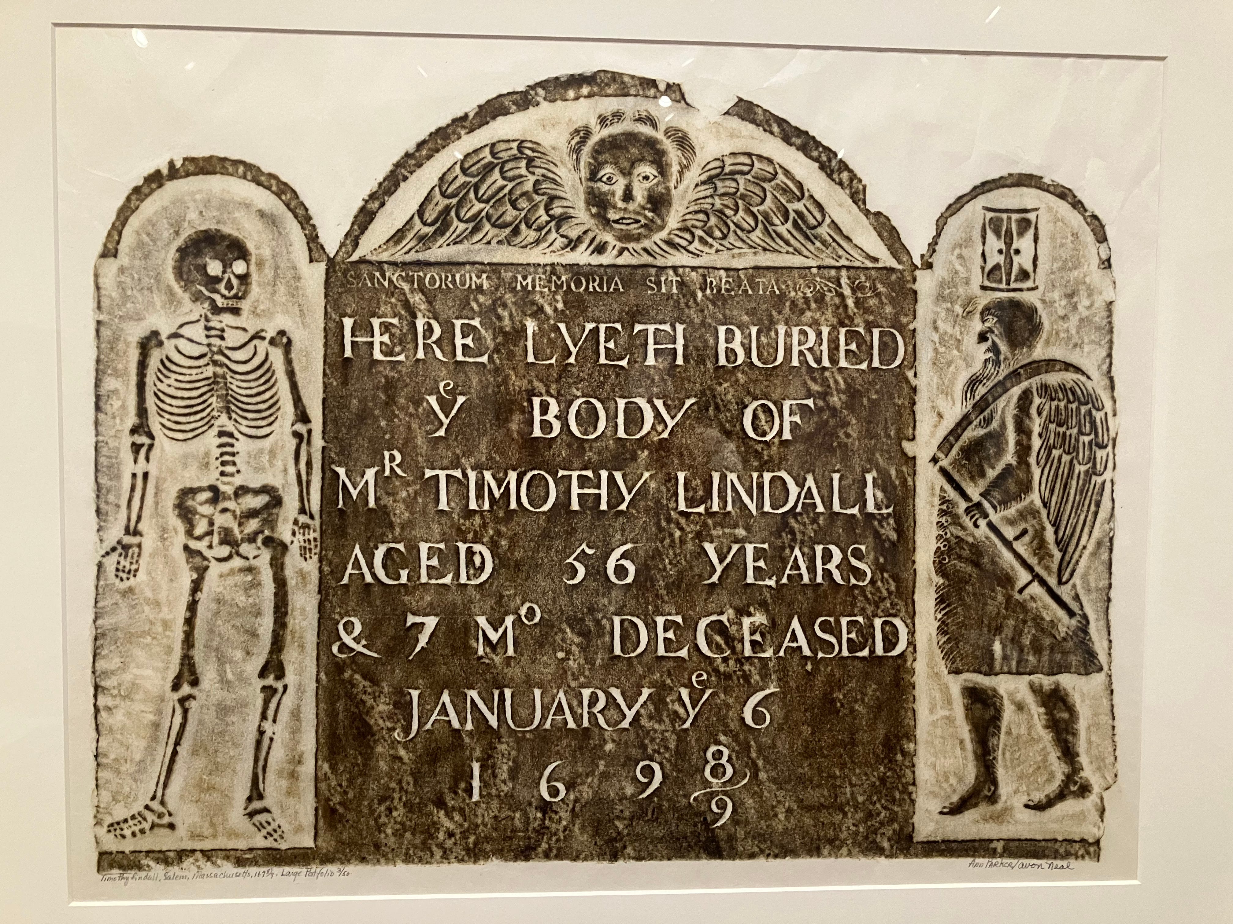
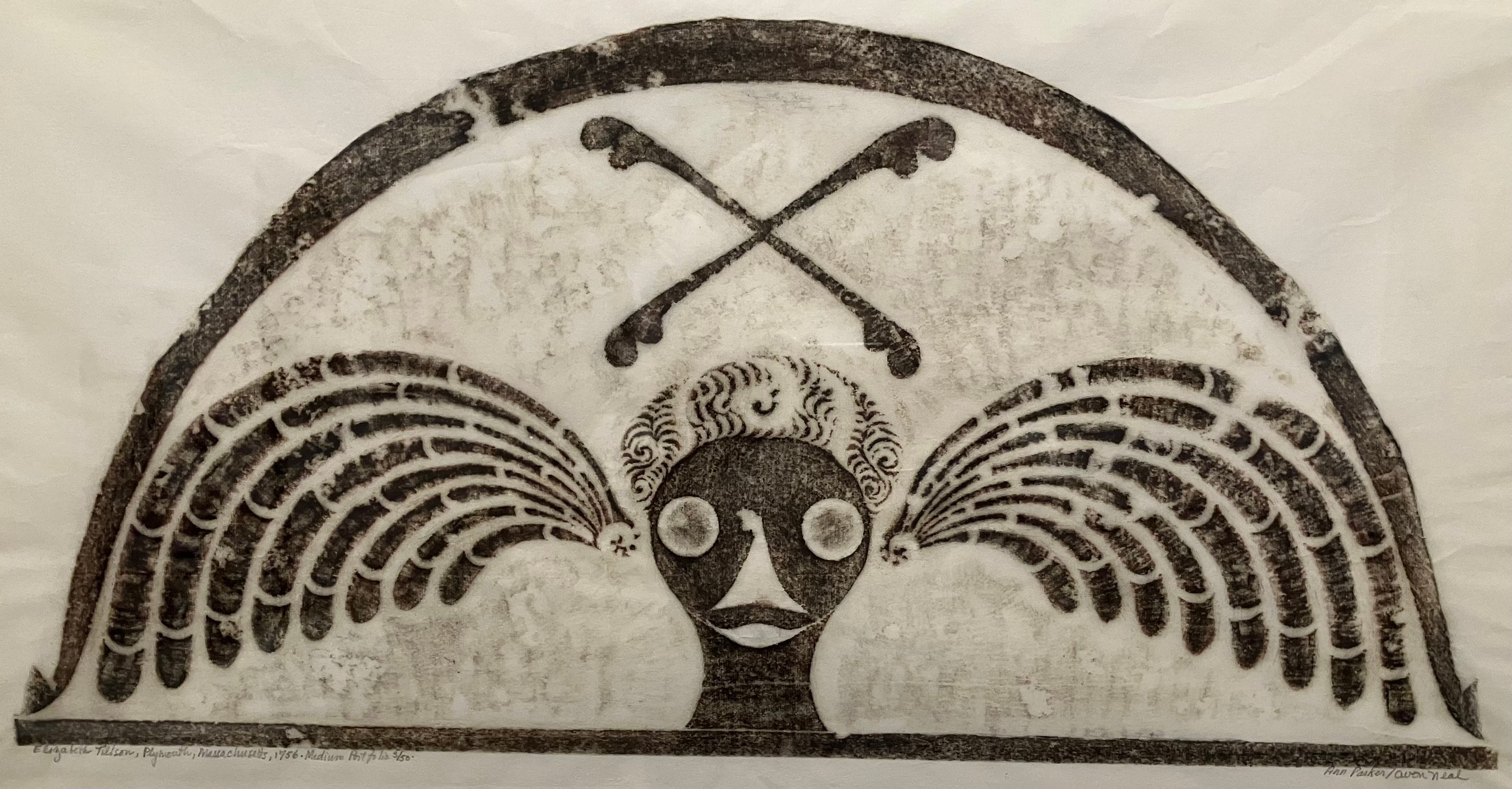
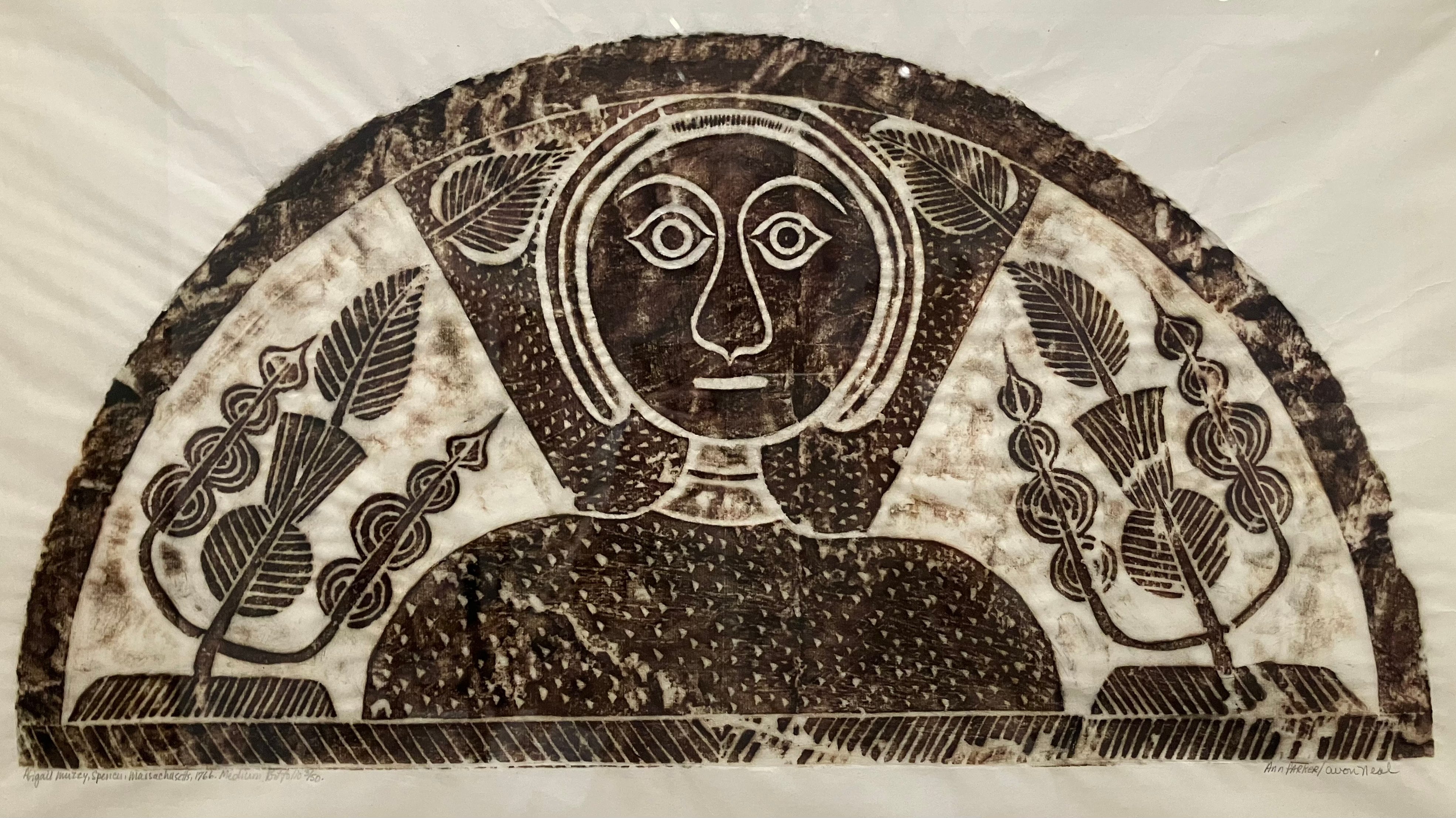
Finally, something local, something from the old, weird New England. In the early 1960s the married artists Ann Parker and Avon Neal traveled around Massachusetts making rubbings of tomb reliefs, an art form they believed to be uniquely expressive.
Here, perhaps for the only time in the annals of early American design, the artist was free to create an object representing his feelings belief and philosophy. In almost all other areas of colonial crafts, the first consideration was utilitarian; houses, tools, utensils, and furniture were quite often beautiful, but it was in gravestone carving that the artist in that rigid society achieved truly dramatic force.6
Harvard owns forty-eight prints after Parker-Neal rubbings. Of the four that are now on display, three are soul effigies, representations of winged heads flying to heaven. Soul effigies, popular in New England in the eighteenth century, developed out of earlier, death’s head tombstones with winged skulls.
I didn’t finish this month’s newsletter in time for Christmas, so consider what follows to be my gift guide for the year to come: a book of Parker and Neal’s rubbings, Early American Stone Sculpture, was published in a limited edition in 1981. Online copies start at $350.
According to the Harvard Crimson of January 29, 1891, Mrs. Fogg had planned to use the $220,000 at her disposal to build an observatory in New York City’s Central Park in her husband’s honor. A Harvard chemistry professor, Josiah P. Cooke, dissuaded her from this plan on the grounds that the sum was insufficient for a state of the art facility. Instead he suggested the creation of a museum for Harvard.
That Sackler—in 2022 a group called the Harvard College Overdose Prevention and Education Students submitted a formal denaming request to the university. A committee of faculty and administrators was formed—a denaming committee. This was in accordance with the procedure set out in 2021 by the Committee to Articulate Principles on Renaming. This August, after two years of deliberation, the Sackler denaming committee published its report. Sackler objects they shall remain: “Arthur Sackler’s legacy is not necessarily deplorable but rather is complex, ambiguous and debatable.”
Not that there aren’t distinct buildings here, too, but the fusion is a little more seamless. Or maybe I only got that impression because I entered and left through the old building, on Quincy Street, and never saw the exterior of the Renzo Piano structure, which faces Prescott Street.
Another highlight: a series of images of the Russian Jews of Woodbine, New Jersey, an agricultural settlement founded in 1891 and described at the time as “the first self-governing Jewish community since the fall of Jerusalem.”
Christ seems to have six wings, but he does not. He is being held in the air by a seraph, one of the six-winged creatures that according to Pseudo-Dionysius the Areopagite are at the pinnacle of the hierarchy of angels.
From the introduction to an exhibition of the rubbings held at the 1968 Smithsonian Folklife festival.
Great piece, thanks!
Among other stuff, the Vibert is very interesting. Would you not say that one effect of photography in later 19th c painting seems to be the use of diffuse, (photo) studio lighting: no deep contrasts, everything evenly lit as if under a heavily clouded sky, except even more so, with no discernible source—except of course where you introduce one, as for the angel / Victory in this case, but even that looks like light from a north-facing window, not from a direct light source.
As if purposely, aggressively going in the opposite direction from plein air? Or is this wrong?
Having been to the Harvard museums, I enjoyed your review as a memory prod and fellow museum-studies-person take on the place.
Funny about the visiting Polish class. I would have hung around a bit & discreetly eavesdropped.
Maybe the colors on the formerly virginal white surfaces are a bit too satuated, but Persian miniatures are very colorful, & look at the exceptionally colorful jewelry & other objects from Egyptian tombs.
Loved your commentary on "grappling."